Corners Fine Wine & Spirits needed a digital content system that could entertain, educate, and inform while building genuine community around events, new products, and limited releases. I identified that the brand was serving two distinct audiences — wine drinkers and bourbon enthusiasts — and needed a way to engage both without fragmenting the brand. By designing a premium, flexible visual system and weaving a secondary color palette throughout the feed, individual products and events were able to stand out while still living inside a cohesive, elevated brand world.


The Visual System
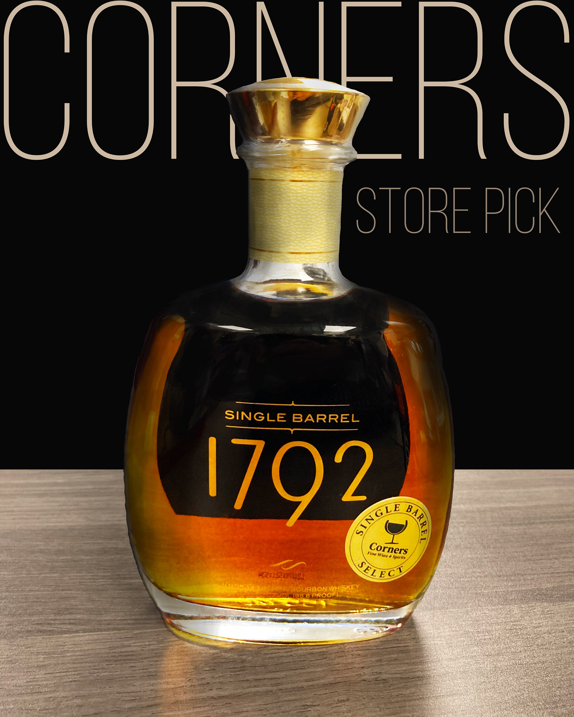
A restrained color palette, consistent typographic hierarchy, and modular layouts created a premium container where bottles, tastings, raffles, and community moments could all live cohesively across Instagram, paid media, email, and landing pages.
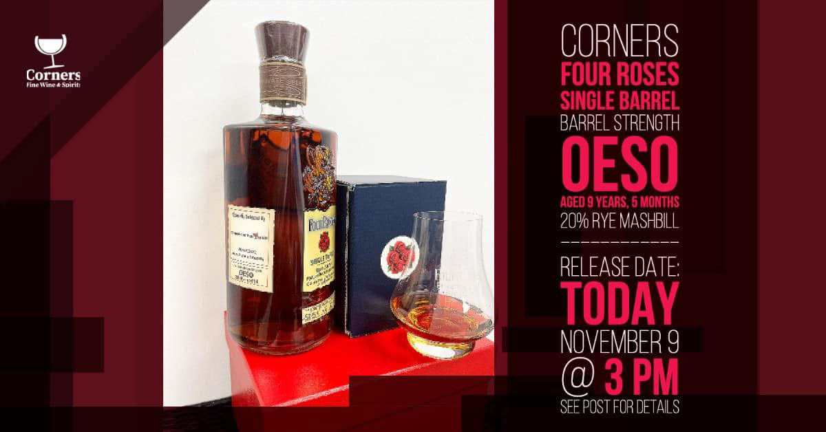
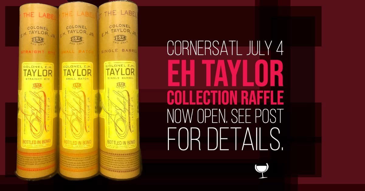
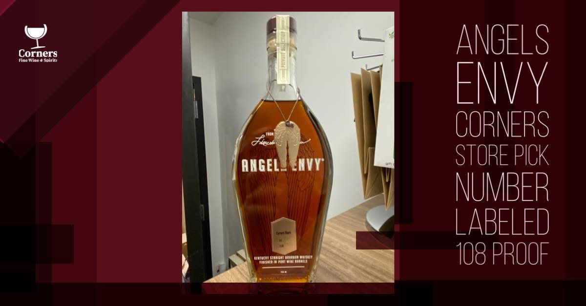
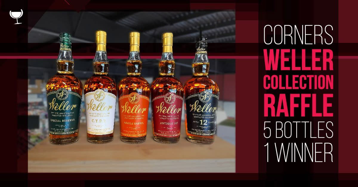
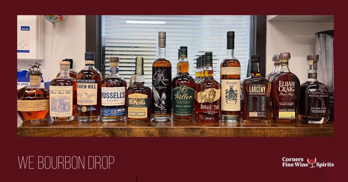
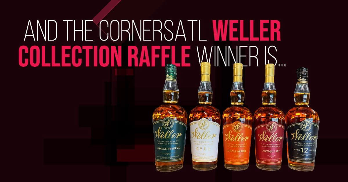
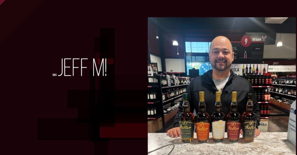
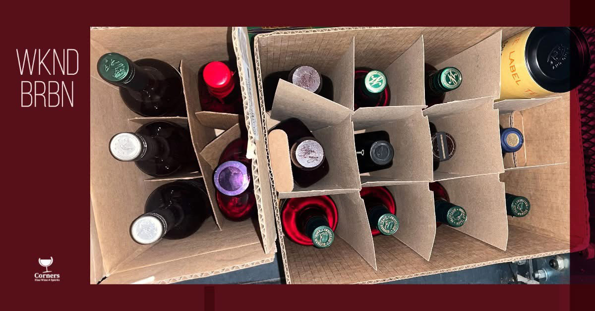
Bourbon Drops & Raffles
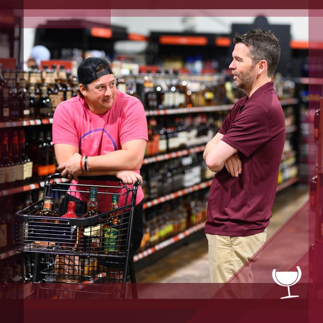
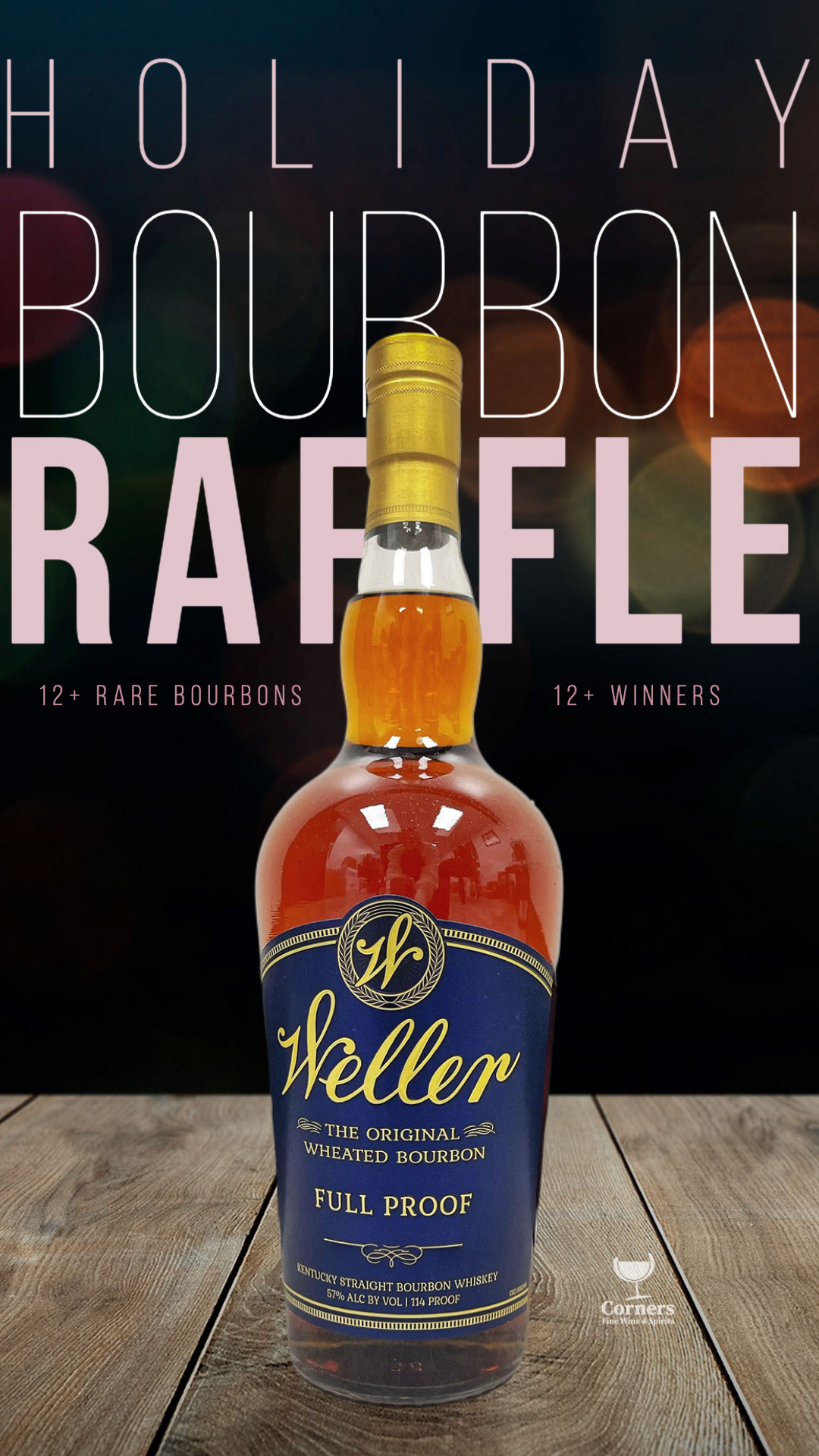
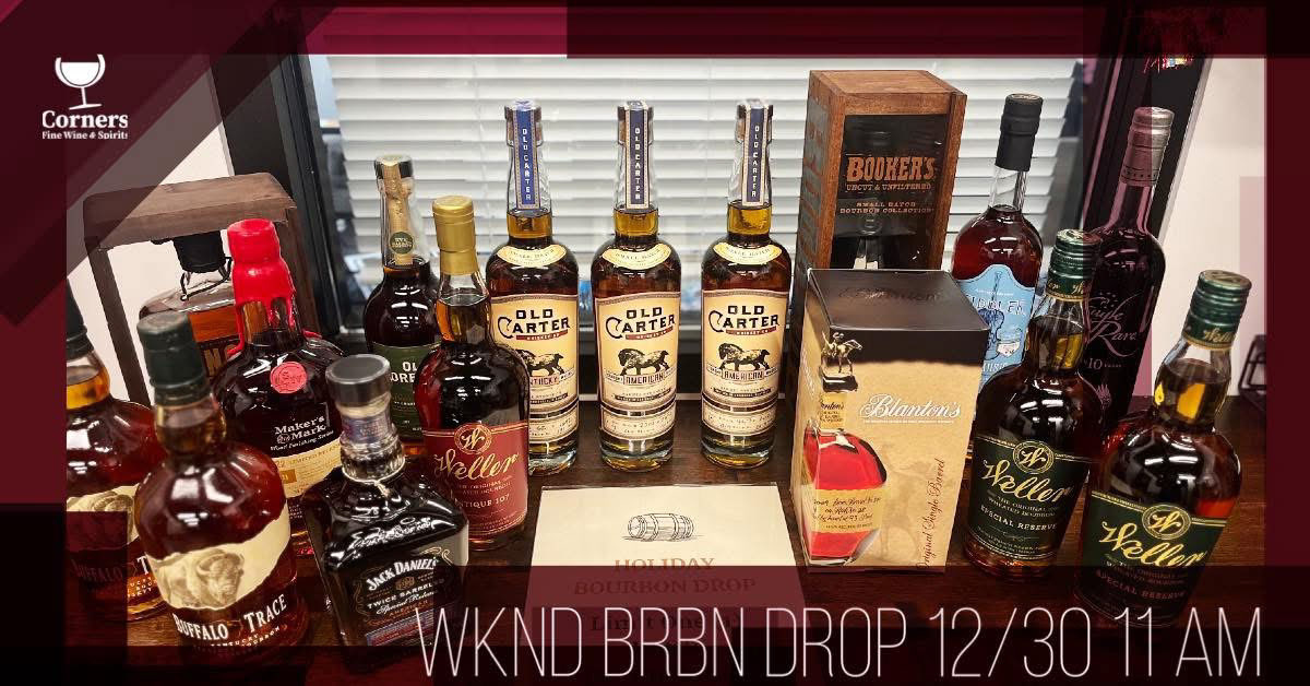
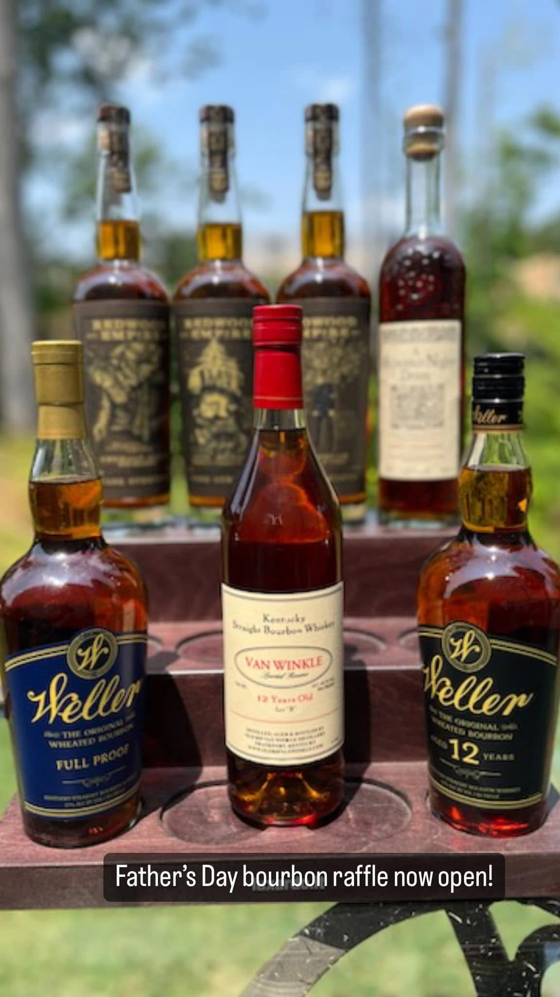
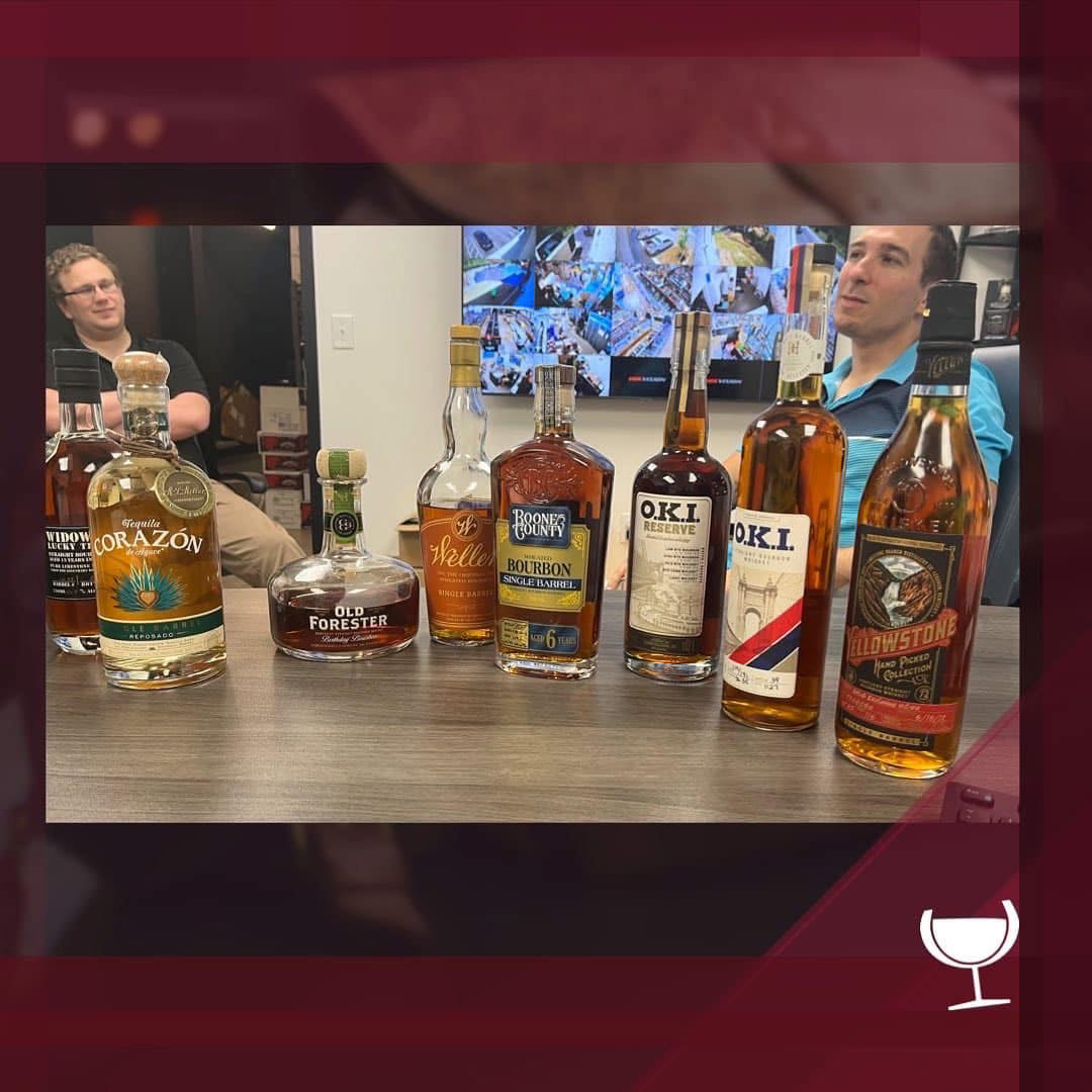
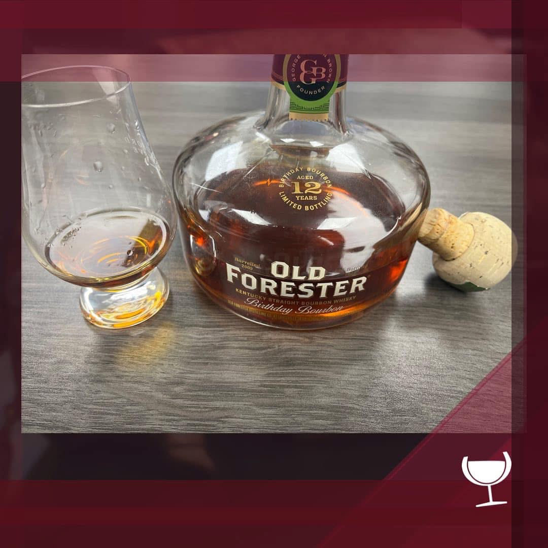
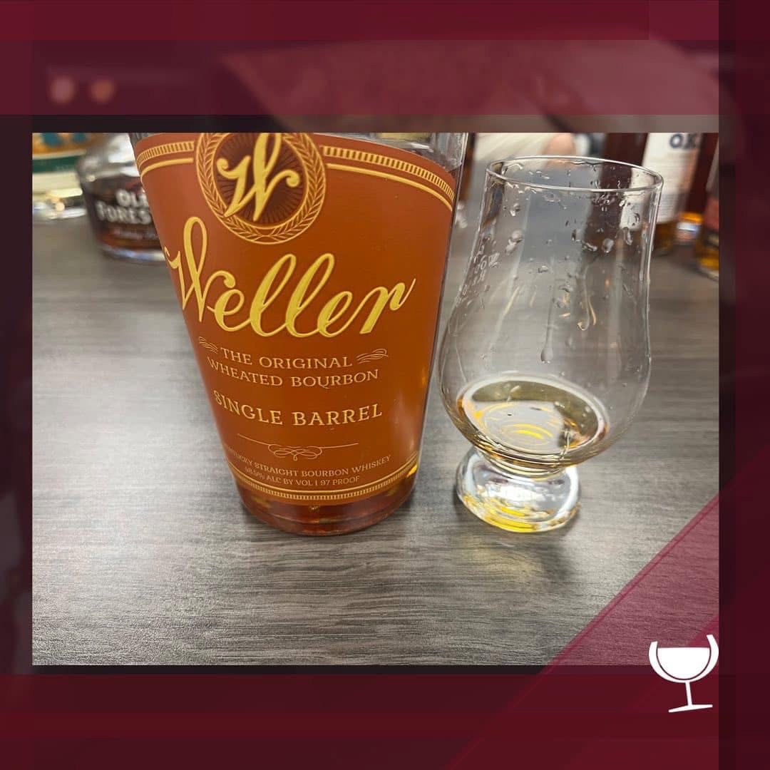
Bourbon enthusiasts will take time off work to stand in line on a random weekday for a chance at a rare bottle — a behavior that was impossible to ignore on social. I identified this highly motivated audience as an untapped opportunity for Corners Fine Wine & Spirits and made it a priority to integrate the brand into that community. By designing content around scheduled and surprise drops, weekend bourbon moments (“WKND BRBN”), and raffle announcements, social became a real-time signal for availability and urgency. This approach turned Instagram and Facebook into a destination for collectors and helped establish Corners as a go-to source for rare bourbon, increasing followers and shares by 300%.

Behind the Scenes Content
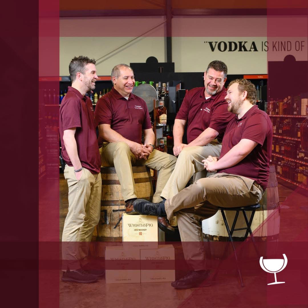
Offering a peek behind the scenes had an outsized impact on engagement. I recognized that followers wanted more than product drops — they wanted to know the people behind the store. By spotlighting the general manager’s day-to-day life, rare tastings with vendors, after-hours moments, and pieces from his personal bourbon collection, the content shifted from promotional to personal. This approach helped build trust, deepen connection, and turn casual followers into an invested community.
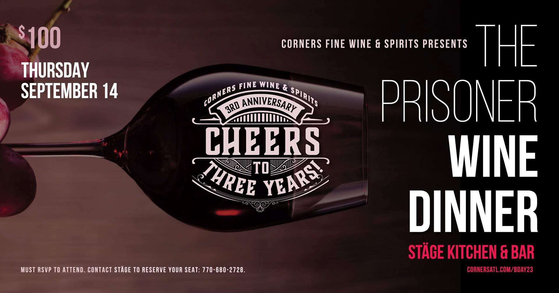
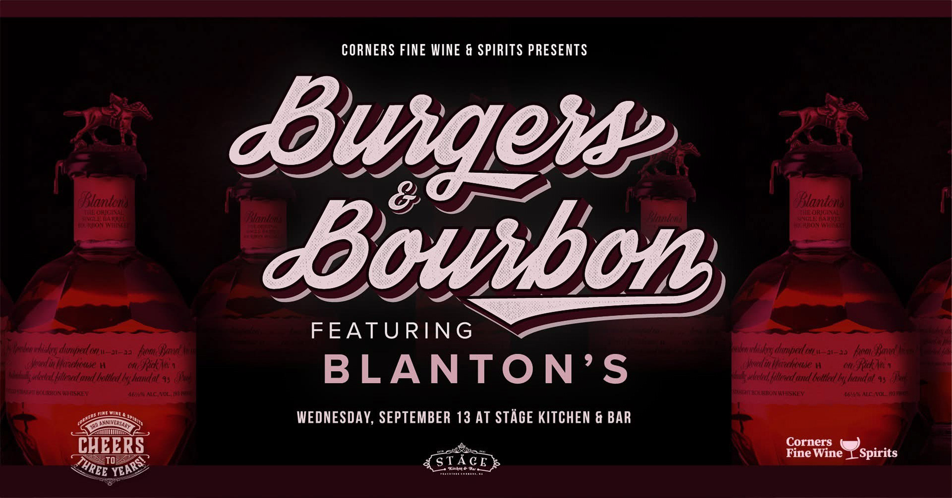
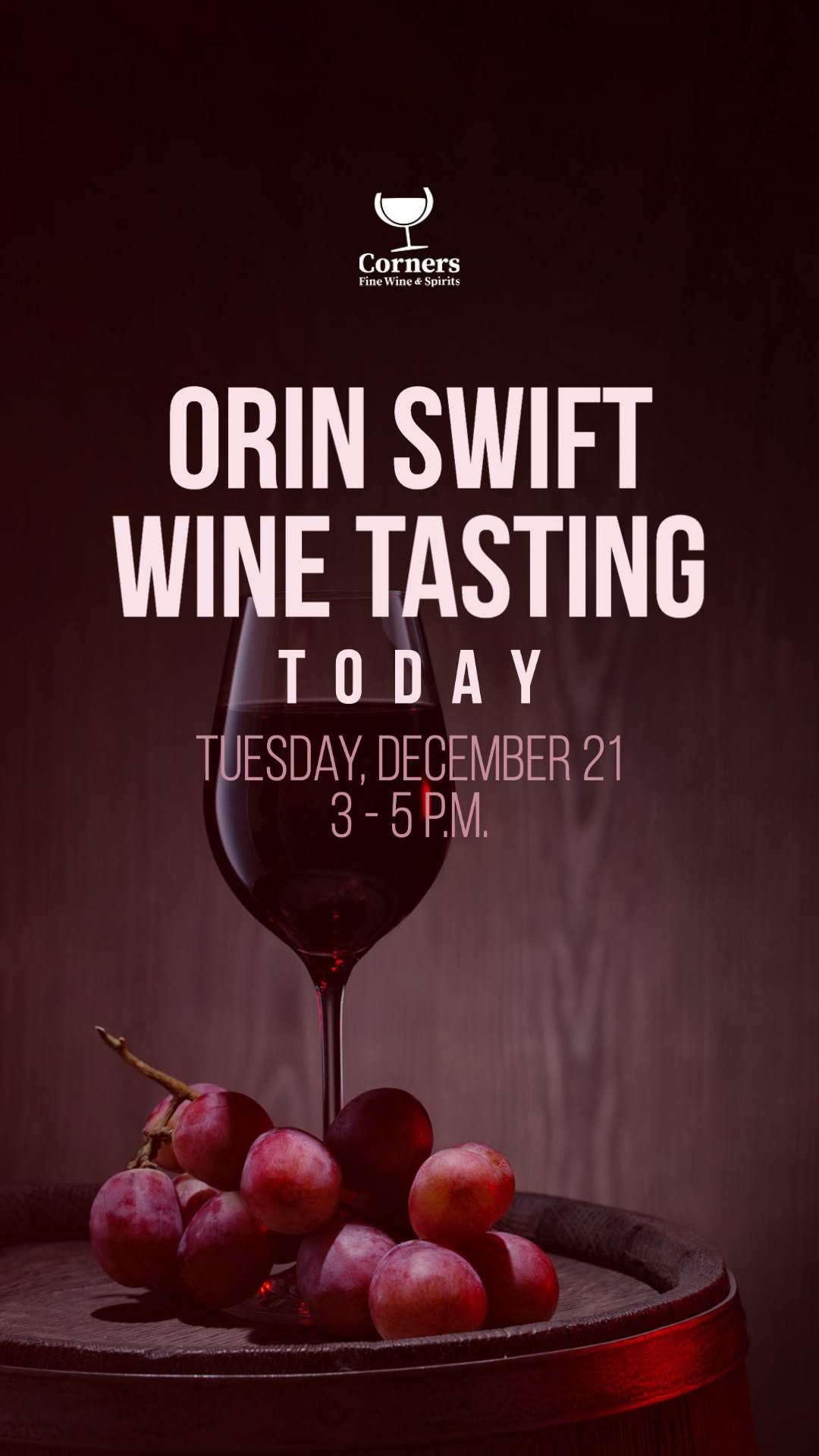
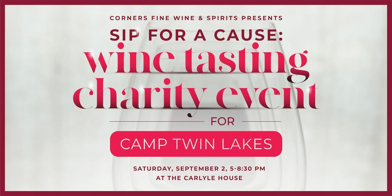
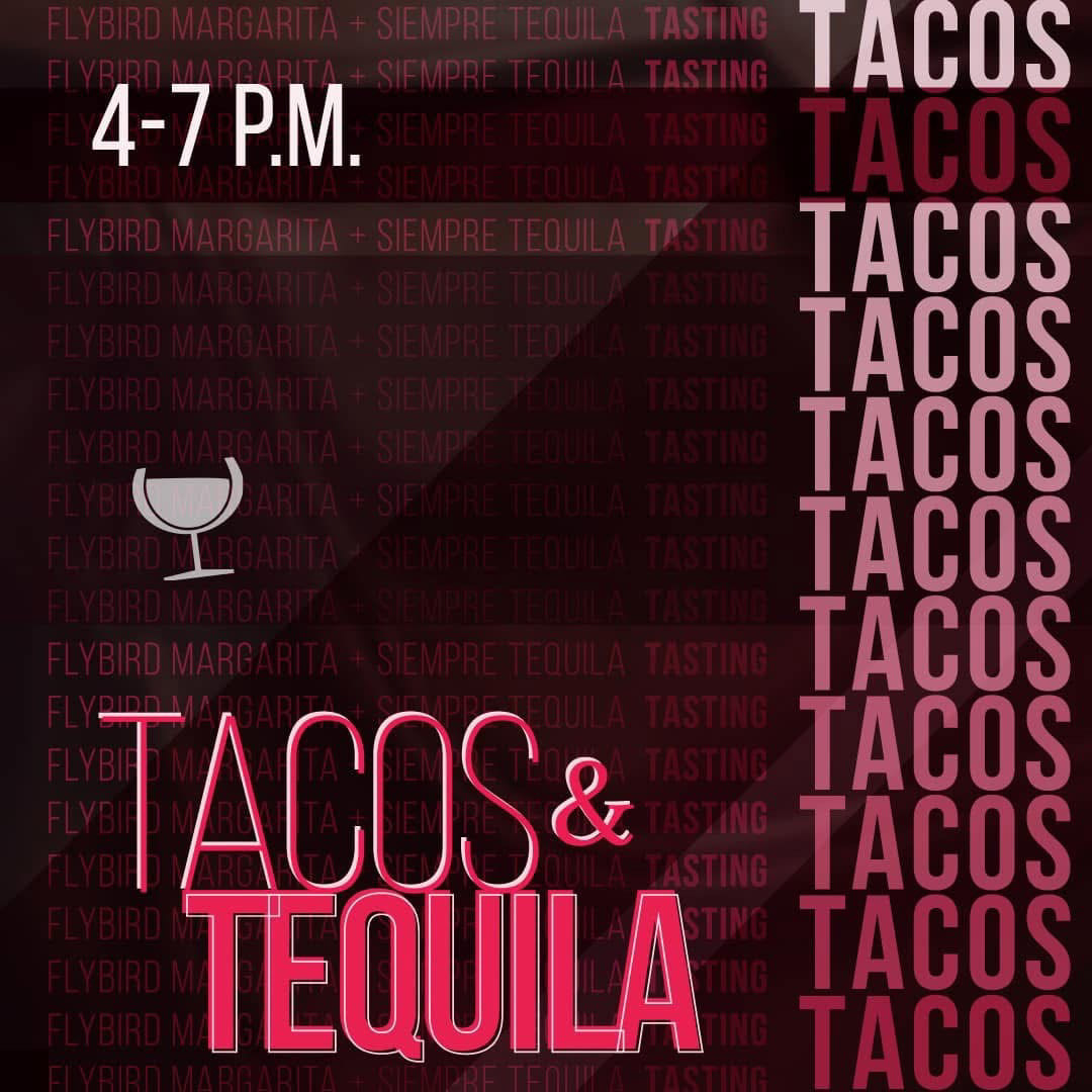
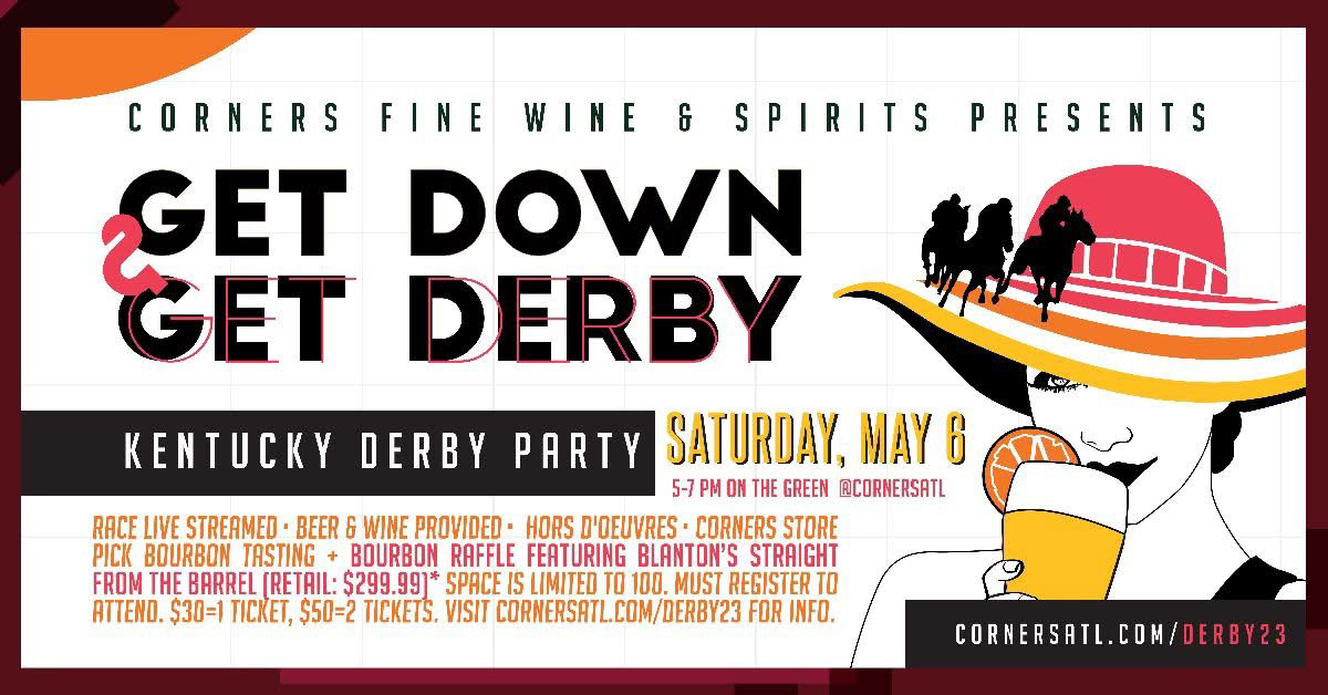
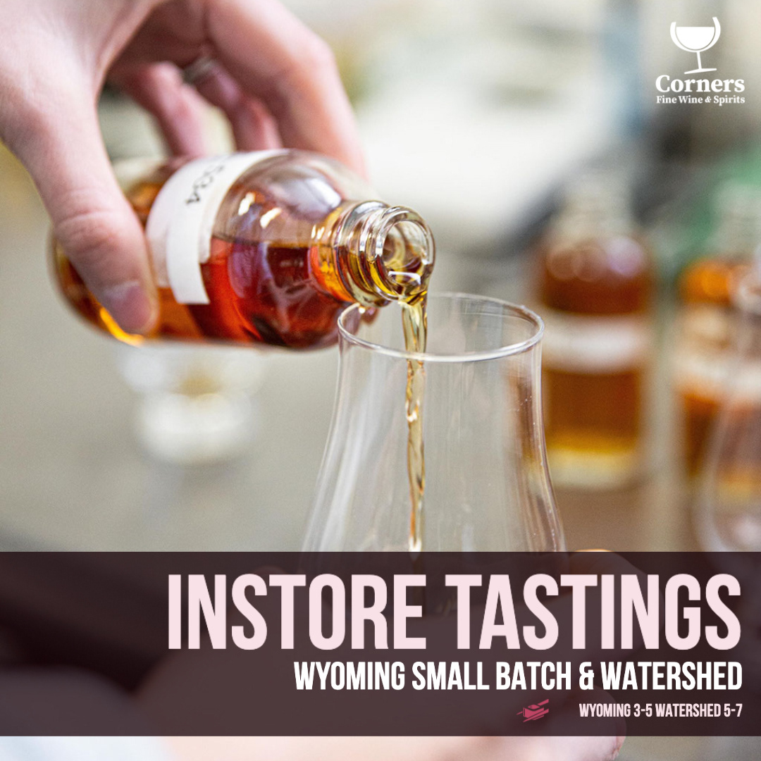
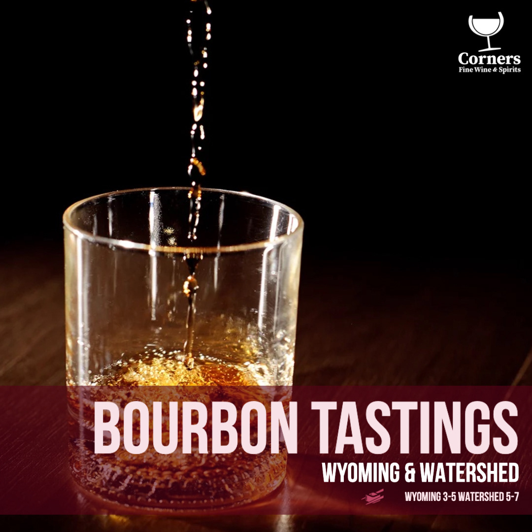
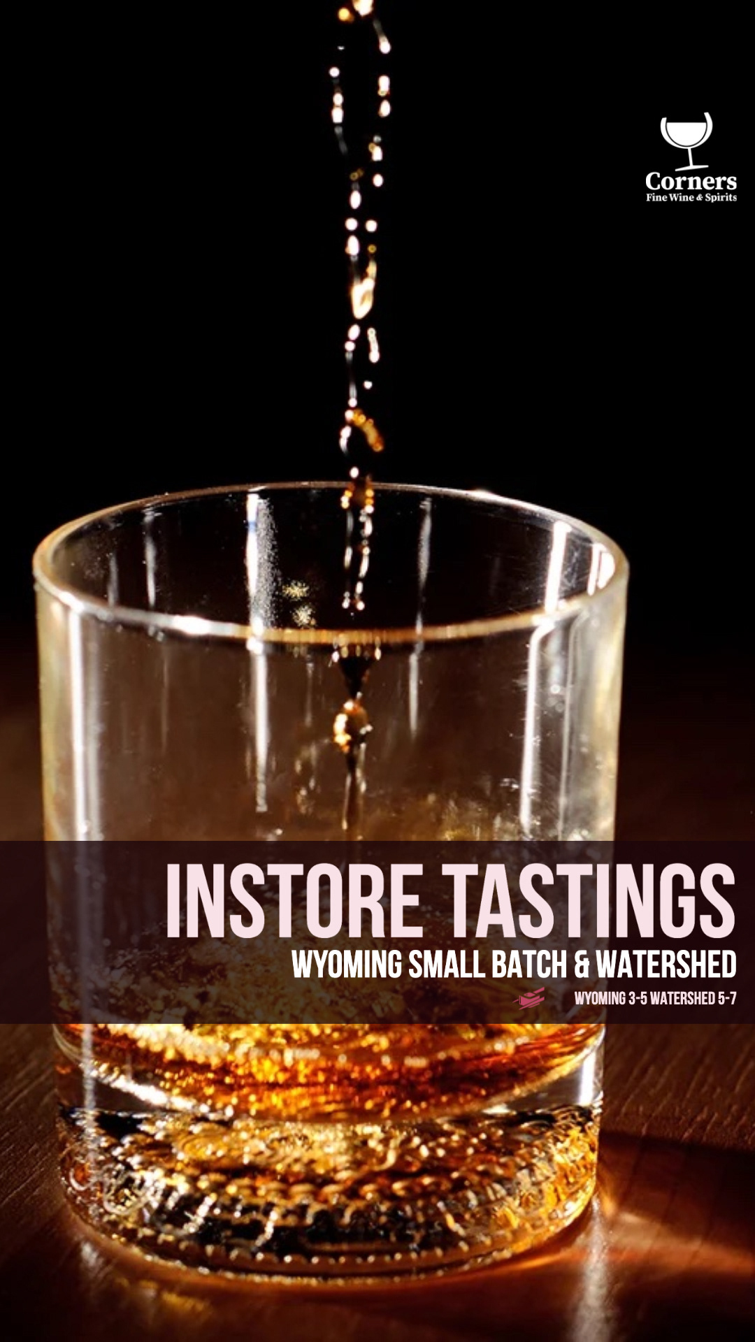
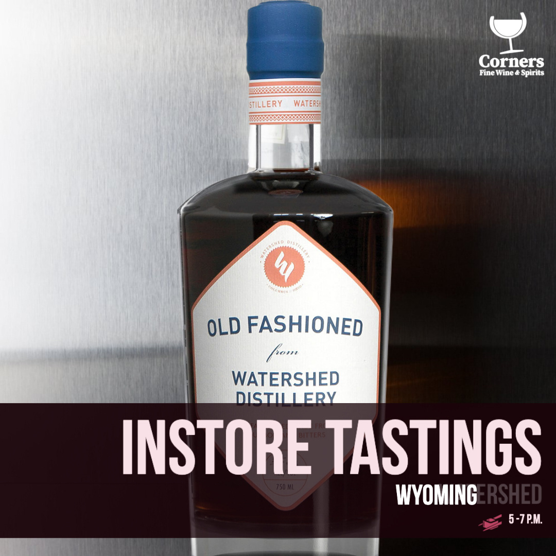
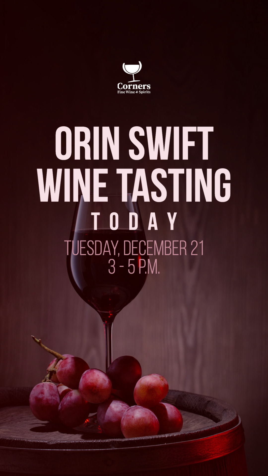
Tastings + Events
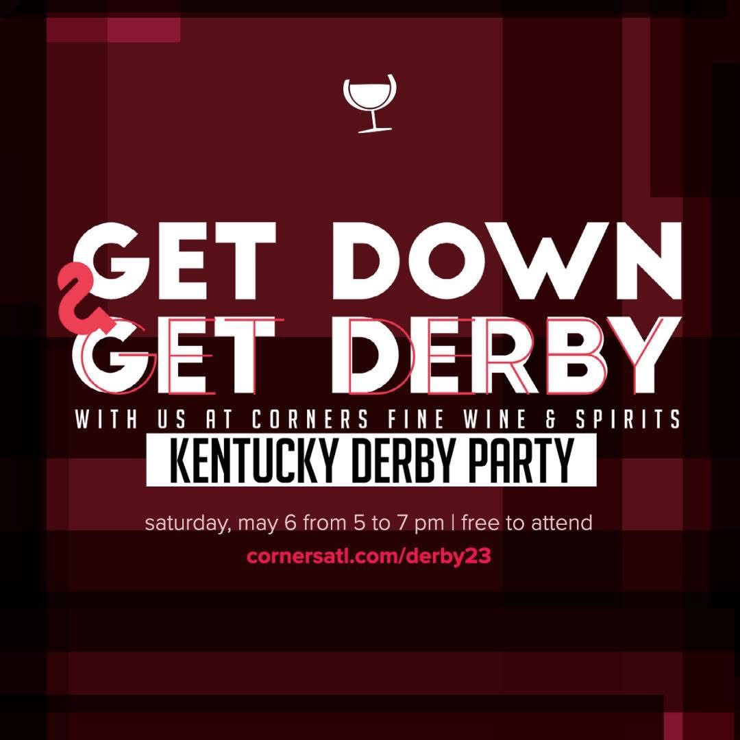
Tastings and in-store events were intentionally designed to build community and drive foot traffic. By promoting these moments through a consistent, premium visual system, social content encouraged online audiences to show up in person. The result was stronger real-world engagement and increased in-store presence across both wine and bourbon audiences.
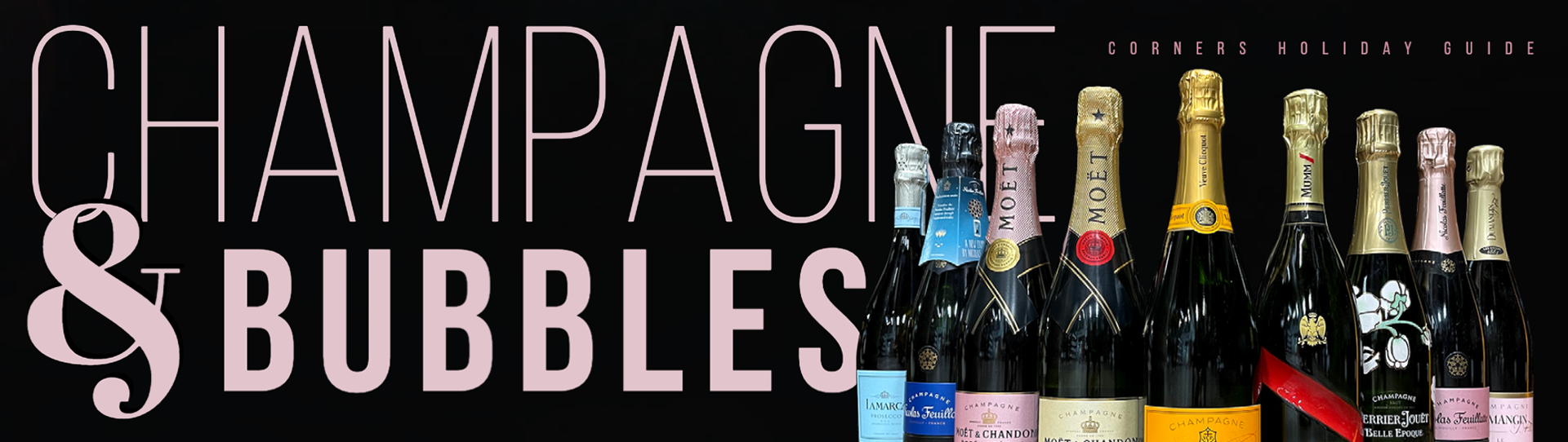
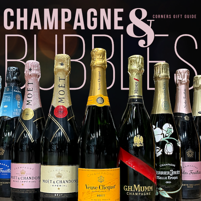
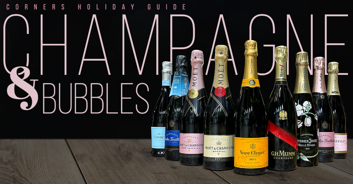
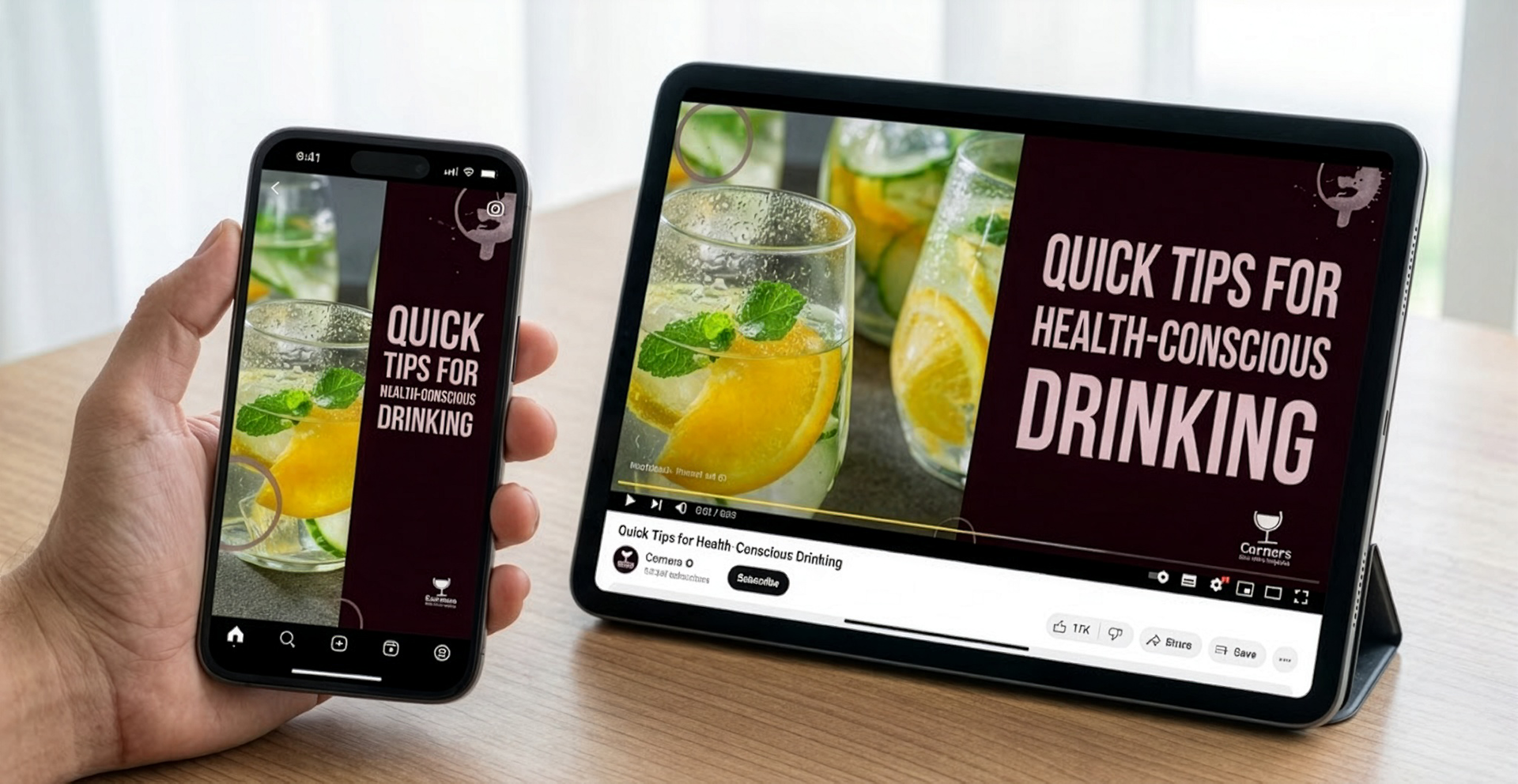
Educational Content
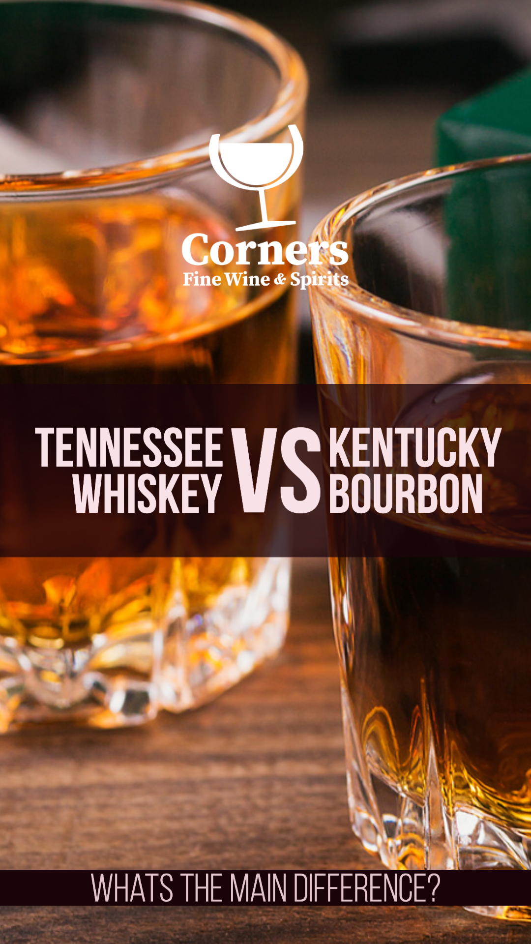
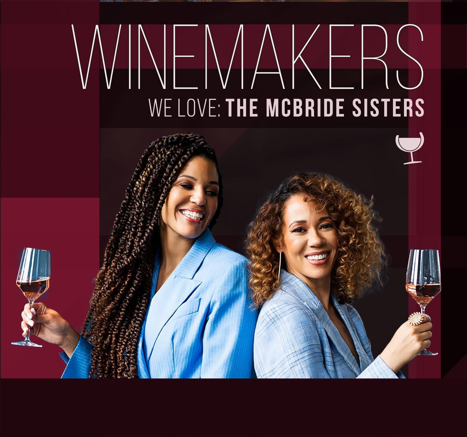
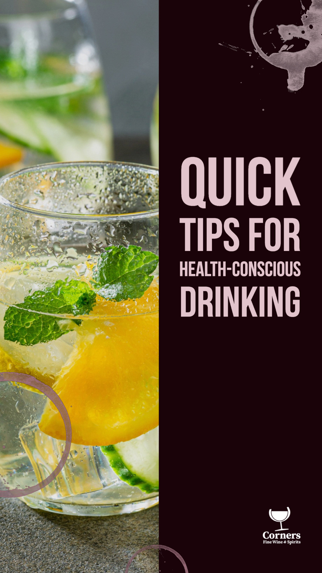
Education played a key role in building trust and confidence with both casual shoppers and enthusiasts. Through holiday wine gift guides with premium custom photography, spotlights on women- and minority-owned spirits brands, and approachable explainers on topics like store picks and the differences between Tennessee whiskey and Kentucky bourbon, the content helped demystify the category. By making complex or intimidating topics feel accessible, social became a place to learn, not just shop.
Outcome
By recognizing distinct audience behaviors and using visual language to bridge them, the content system helped Corners grow both reach and loyalty. The Instagram and Facebook presence evolved into a destination for bourbon enthusiasts while remaining welcoming to wine drinkers, resulting in a 600% increase in followers and the growth of a highly engaged bourbon and local Atlanta community.