Overview
Client: Georgia Computer, Inc.
Scope: Full Brand Redesign + Website Redesign
Role: Brand Design, Art Direction, Visual Systems, Website Design, Print & Collateral Design
Year: 2022
Scope: Full Brand Redesign + Website Redesign
Role: Brand Design, Art Direction, Visual Systems, Website Design, Print & Collateral Design
Year: 2022
Georgia Computer, Inc. partnered with Synergetic Media to modernize their brand and digital presence. The goal was to reposition GCI as a trusted, enterprise-grade technology partner while clarifying complex IT asset lifecycle services for enterprise and healthcare audiences.
Challenge
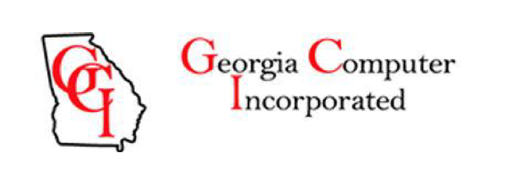
GCI’s previous brand and website struggled to clearly communicate the value of their services.
Key challenges included:
A dated visual identity that didn’t reflect GCI’s expertise or scale
Inconsistent branding across sales, marketing, and digital touchpoints
A complex service offering that was difficult to understand quickly
Limited trust signaling in a highly regulated, security-driven industry
The redesign needed to balance approachability and authority, while supporting long-term growth across marketing and sales channels.

The Solution
I led a full brand redesign alongside a complete website overhaul to create a cohesive, scalable system.
Brand System:
Redesigned logo and mark system
Modernized typography and color palette
Custom graphic language and iconography
Clear, confident brand voice aligned to enterprise clients
Brand Identity Approach
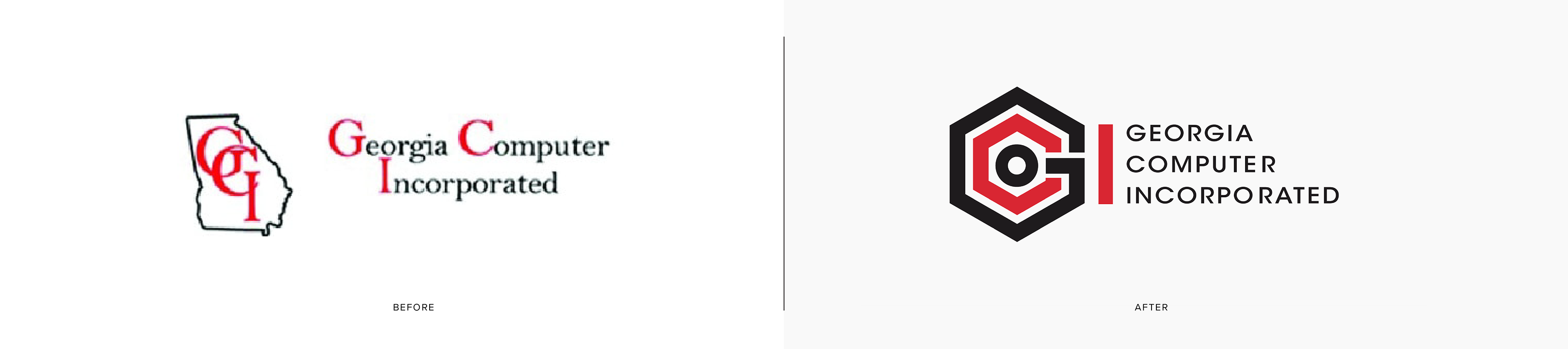
My approach focused on strategic evolution rather than reinvention. GCI’s existing palette was refined—introducing cleaner, high-contrast tones while maintaining familiarity. I designed a new geometric logo built on structure and connectivity, paired with modern sans-serif typography for stronger readability.
I then expanded the identity into a full visual design system, establishing color usage, type hierarchy, iconography, and layout guidelines. This system informed a refreshed website, updated sales collateral, and large-format event materials—ensuring every expression of the brand felt unified.
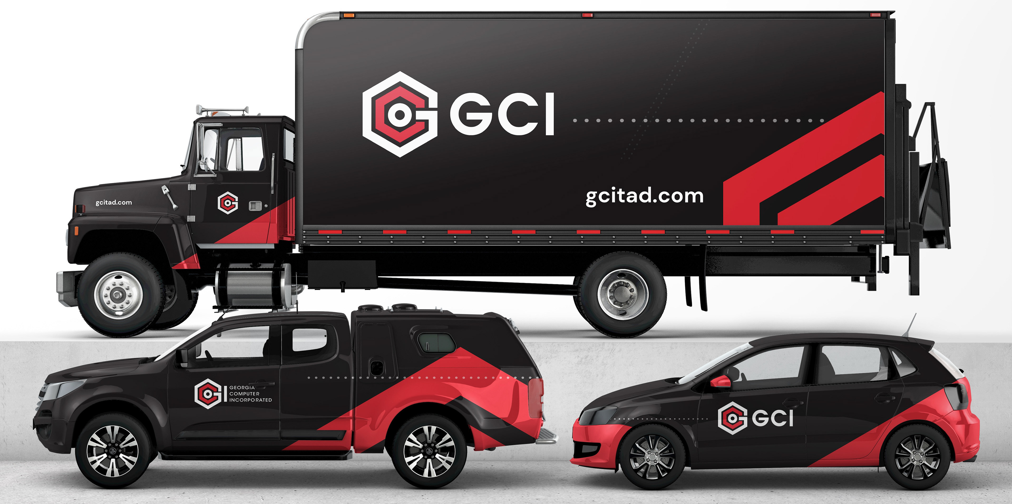
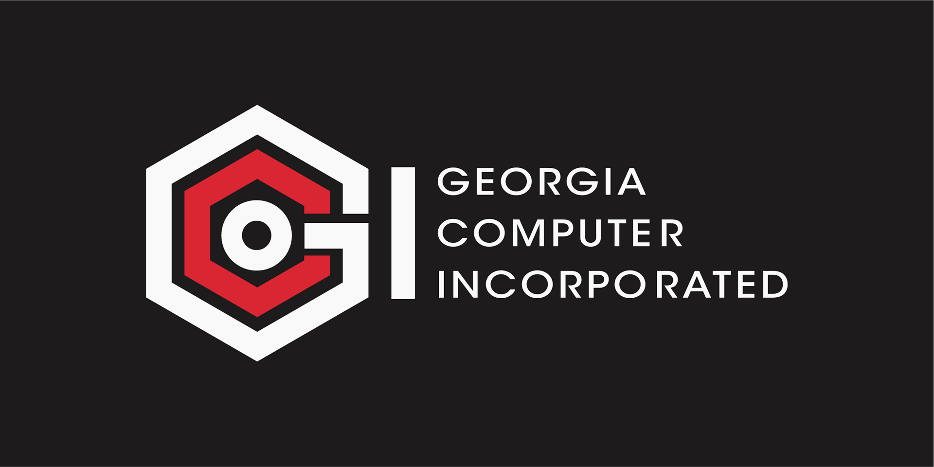
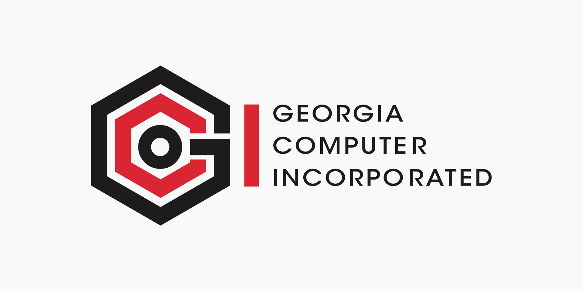
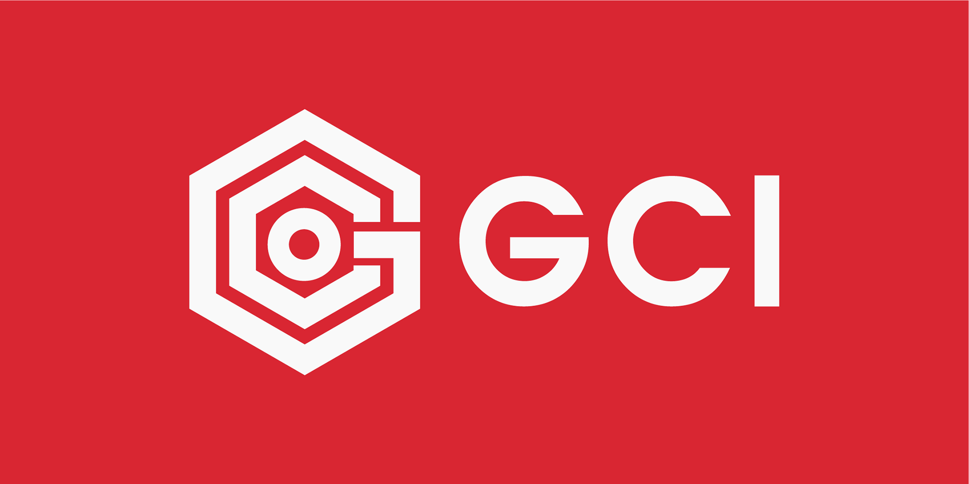
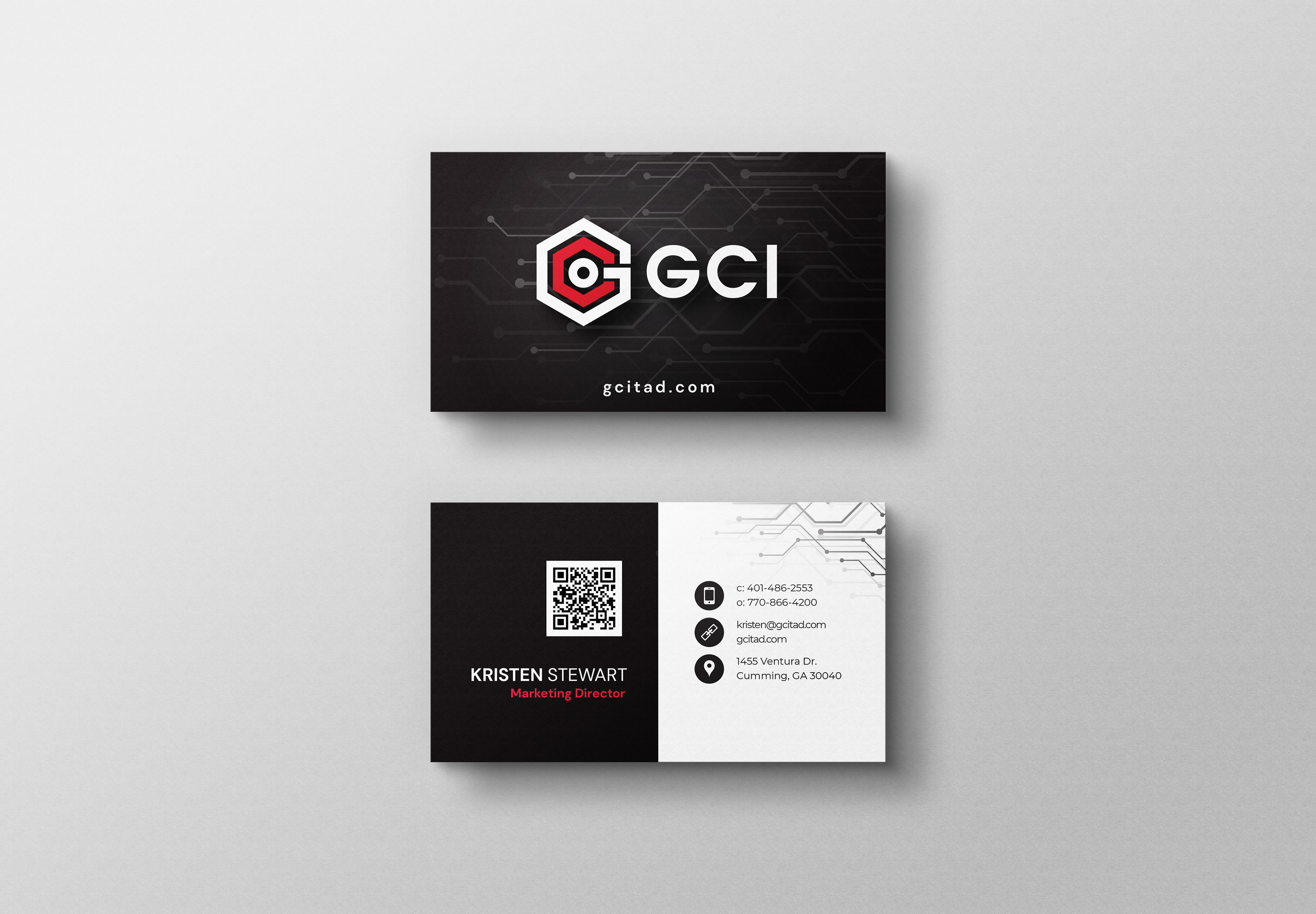
Logo Redesign
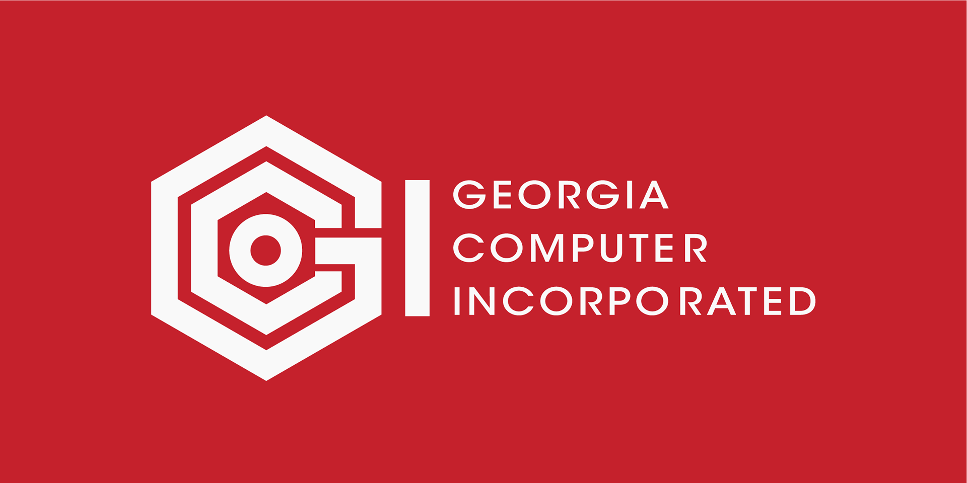
For the refreshed logo design, we settled on a combination of the company name as well as their services by abstracting the letters GCI into a shape reminiscent of circuitry.
A modernized monogram and wordmark designed for clarity, scalability, and digital usability.
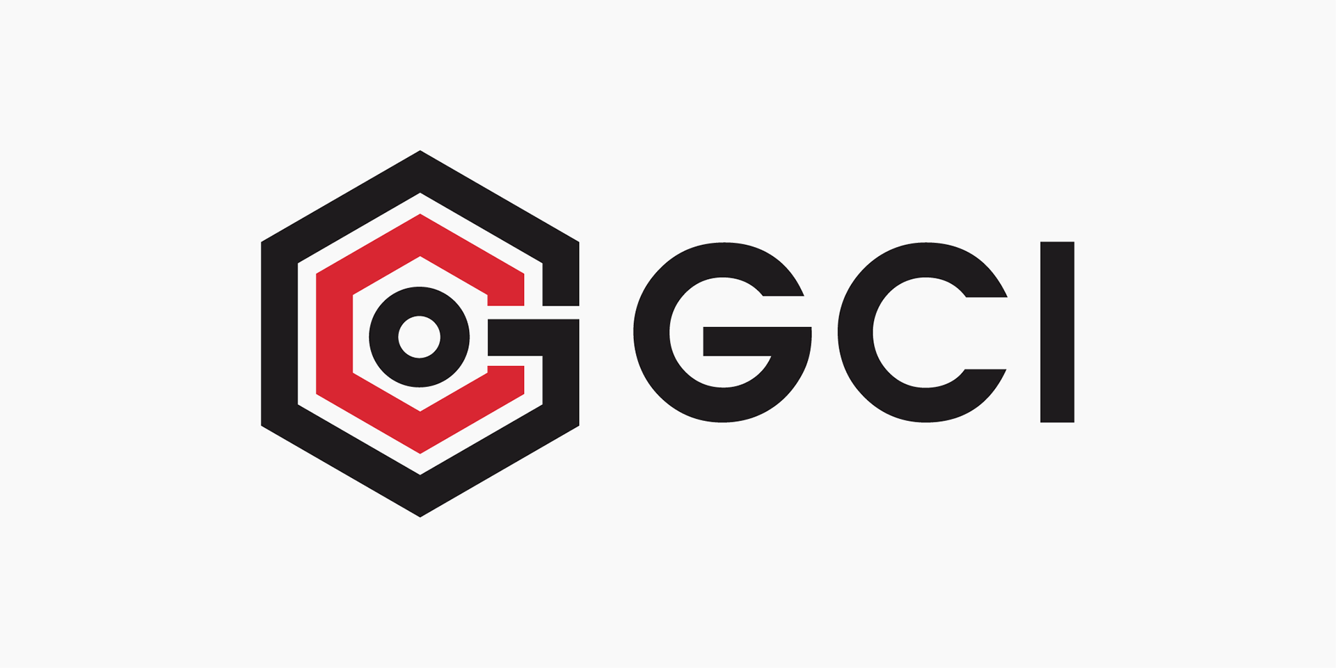
Primary Logo Design
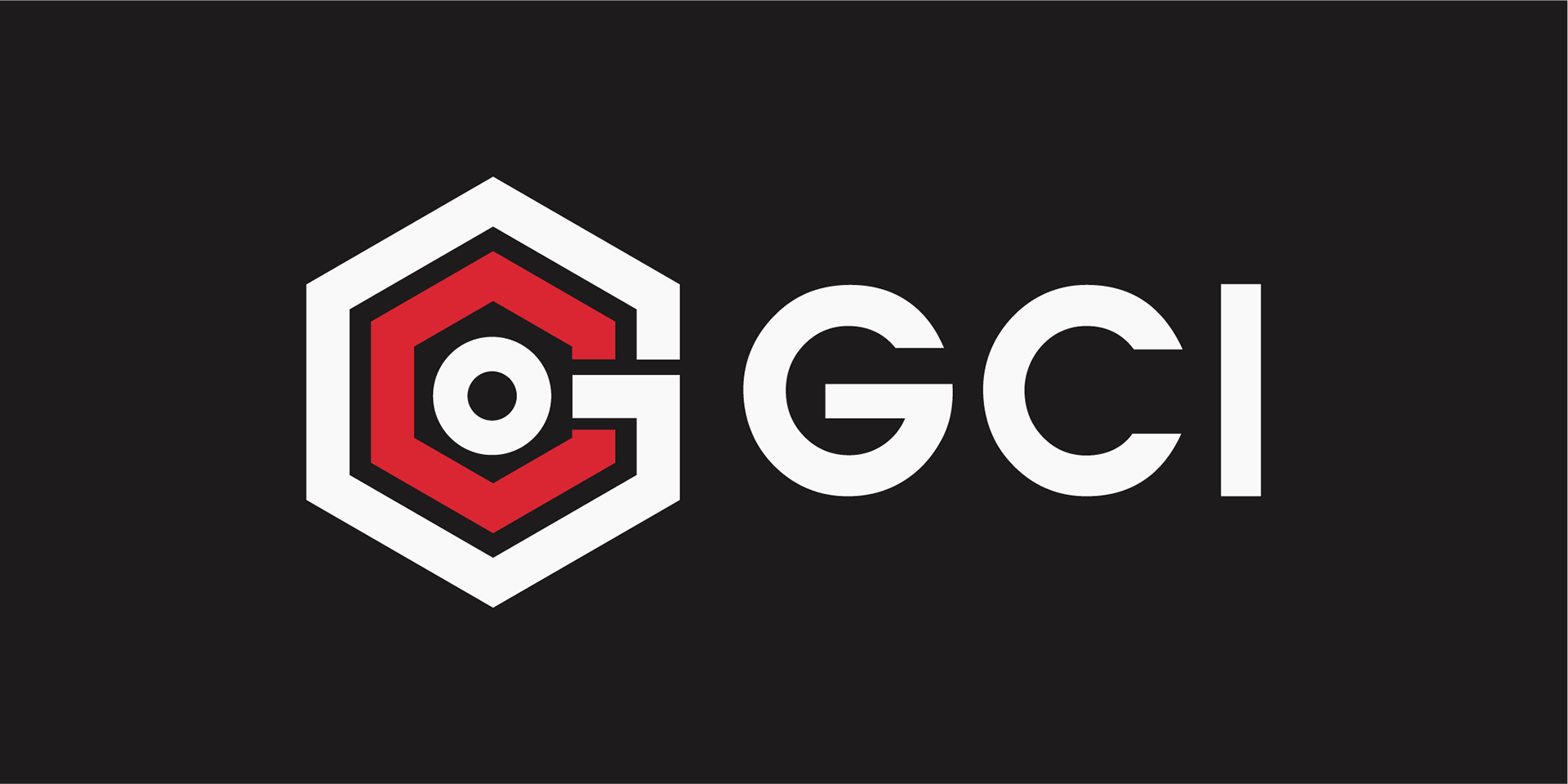
Primary Logo Design Inverse
Primary Logo Design Inverse Variation 2
Stacked Logo Variation
Stacked Logo Variation
Stacked Logo Variation

Horizontal Logo, Secondary

Horizontal Logo, Secondary
Visual Identity System
I then expanded the identity into a full visual design system, establishing color usage, type hierarchy, iconography, and layout guidelines. This system informed a refreshed website, updated sales collateral, and large-format event materials—ensuring every expression of the brand felt unified.
The brand imagery integrates circuitry into everyday objects and focuses on people in everyday situations. That helps make this hi-tech company more people-oriented, relatable and accessible to consumers.
Visual ID Deliverables
Updated palette, typography, and iconography. Digital + print application guidelines, grid + spacing system
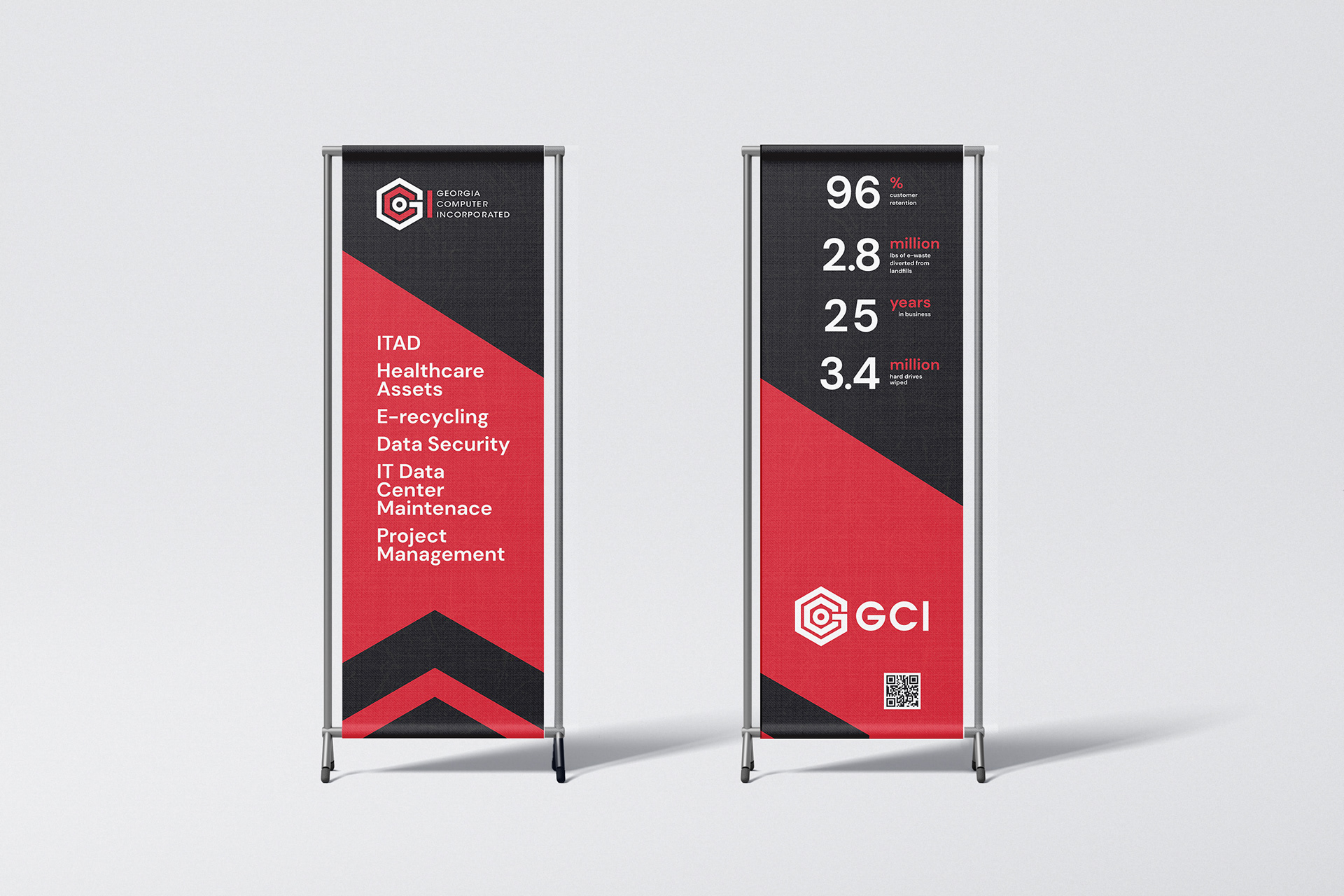
Flexible layout system applied across print and large-format environments.”
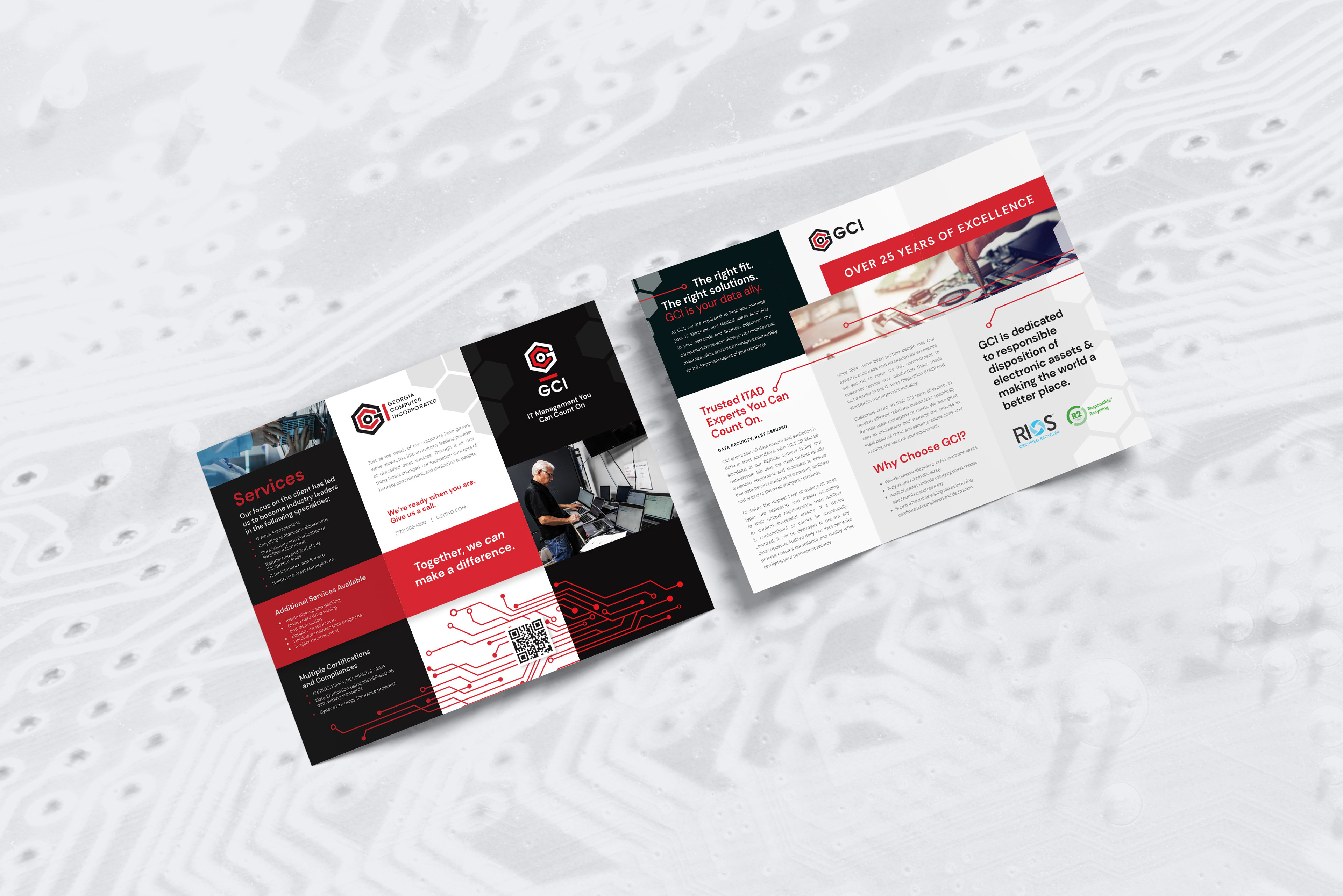
A modular, easy-to-scan layout communicating GCI’s capabilities in a professional, approachable way.

Clean, modern cards that emphasize brand clarity and hierarchy.
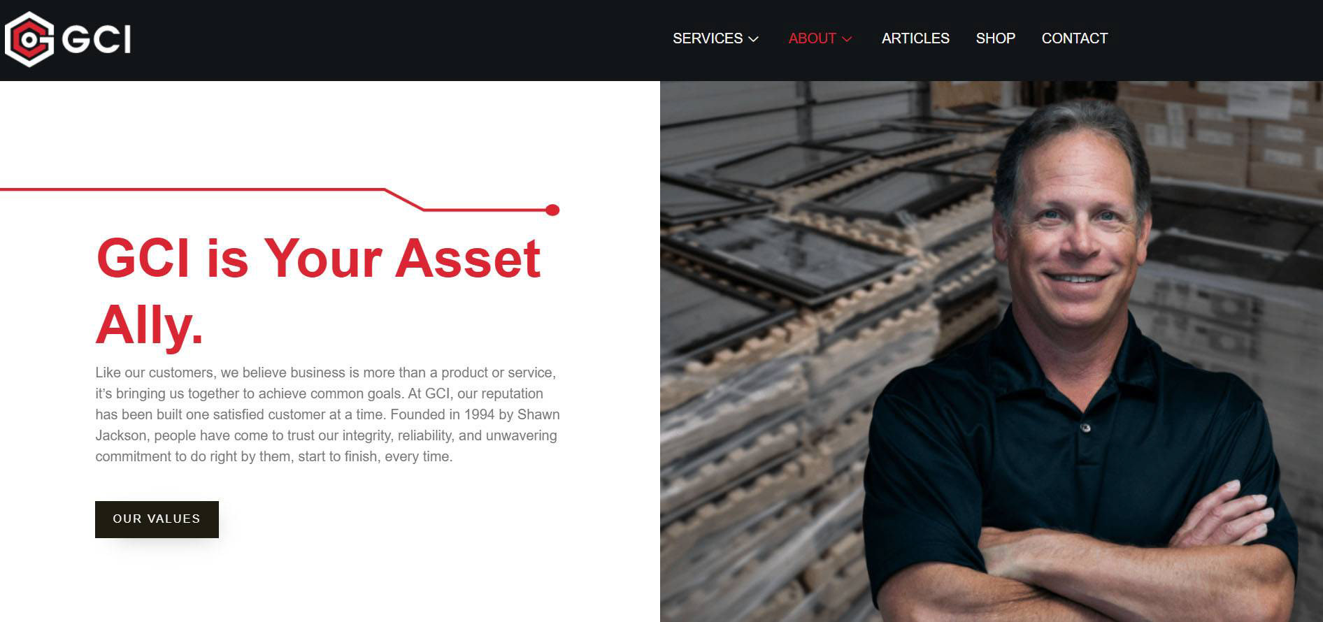
Website Redesign
Refresh of the homepage and key user flows, focusing on accessibility, clarity of services, and a contemporary visual presence. Clean digital hierarchy and updated UI for a more intuitive customer experience.
Rebuilt information architecture to clarify services. Designed a clean, conversion-focused homepage. Created structured service templates for scalability. Integrated brand elements consistently across digital touchpoints.
The result is a unified identity that positions GCI as a modern, trustworthy technology partner while improving usability and clarity across platforms.
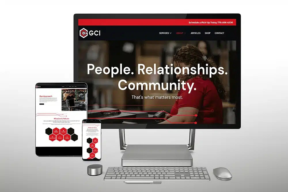
Refresh of the homepage and key user flows, focusing on accessibility, clarity of services, and a contemporary visual presence.
Results
The redesigned identity positions Georgia Computer, Inc. as a modern, trustworthy technology partner—strengthening brand recognition while improving usability across platforms. The cohesive system now supports their sales, marketing, and digital presence with consistency and professionalism. Modernizing the visual identity and clarifying the brand voice has helped GCI better communicate the real value of their services.
The redesigned brand and website drove measurable business impact shortly after launch:
+21.98% increase in users
+23.98% increase in sessions
+26.09% increase in engaged sessions
300% increase in domain authority month over month
The new identity continues to support GCI’s sales, marketing, and digital efforts with consistency and professionalism.
This project reflects a holistic approach to brand and digital design — balancing strategic clarity, visual systems, and real-world performance. If revisited today, I would explore even more modular storytelling components, but the foundation remains a strong, scalable system built to grow with the business.