The Opportunity
The success of this case study really started with a good CR a few key insights:
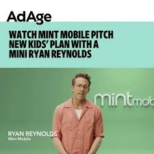
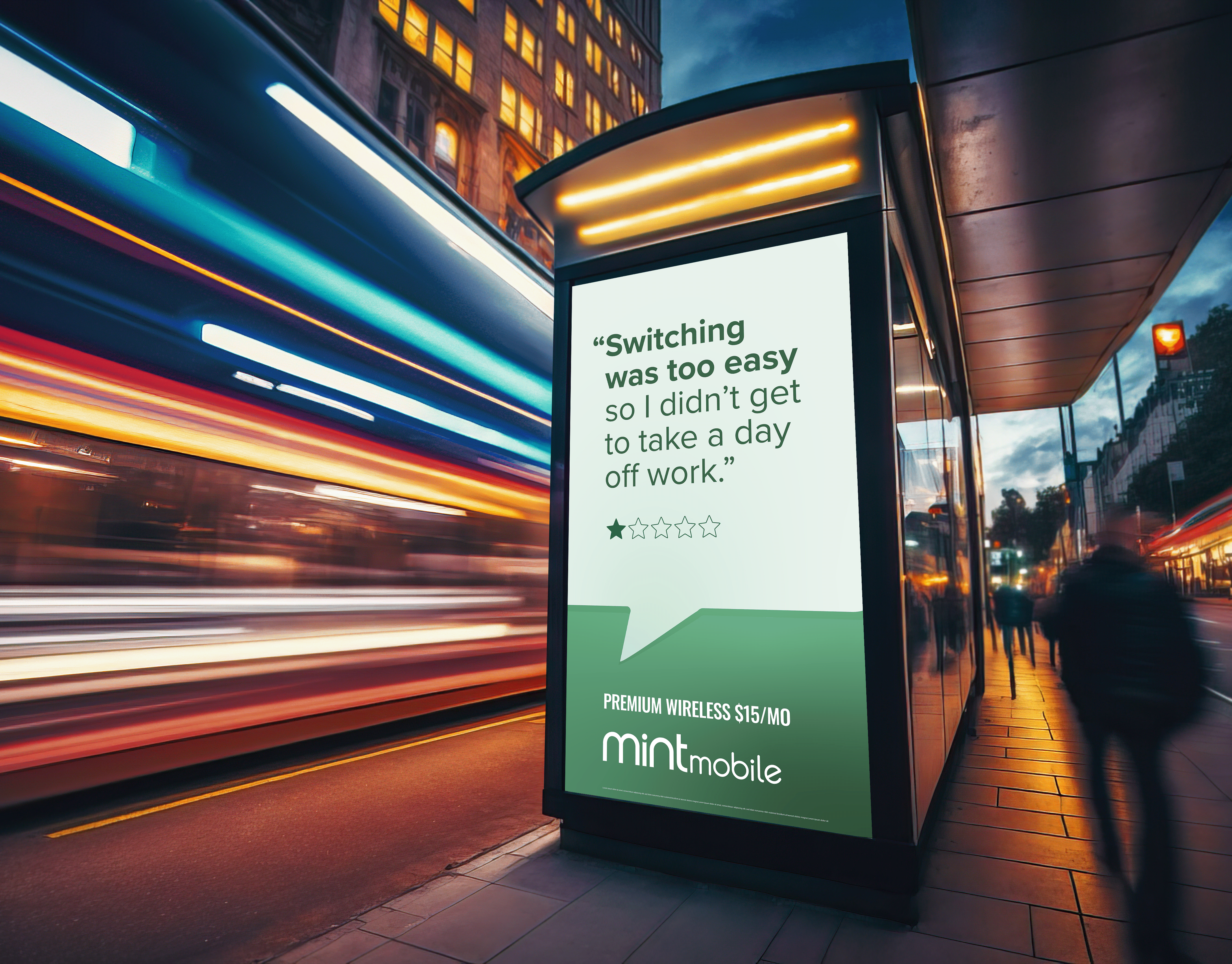
In 2024, Mint Mobile identified a major strategic opportunity: 80% of parents said they would consider purchasing a kids phone plan from a carrier separate from their own. While the category represents a $400MM market, no major wireless provider had claimed clear ownership. Why? Because when to get a kids plan is a hot topic of debate on the internet and there is no clear, distinct answer.
Mint aimed to build a brand designed for parents, rooted in trust, safety, and imagination.
Designing a Kids Brand… Without Marketing to Kids
We needed to build a brand that:
Speaks to parents, not children (legal requirement)
Feels distinct yet undeniably Mint
Pops on shelf next to existing SIM kits
Establishes trust in a category where safety + reliability drive decisions
Joins a heated cultural conversation without declaring “the right age”
Strategy: A Trusted Way to Stay Connected
Mint Kids needed to:
Feel imaginative enough to capture childhood energy
Feel premium + safe enough to earn parent trust
Build a visual bridge between Mint and a new audience
Visual Identity
Building the Mint Kids Look + Feel
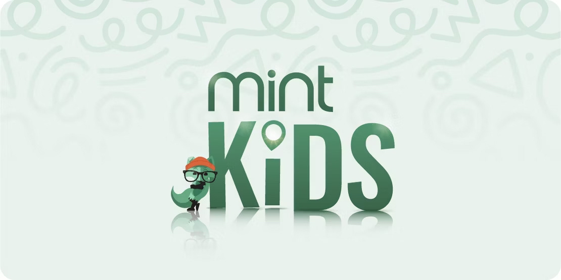
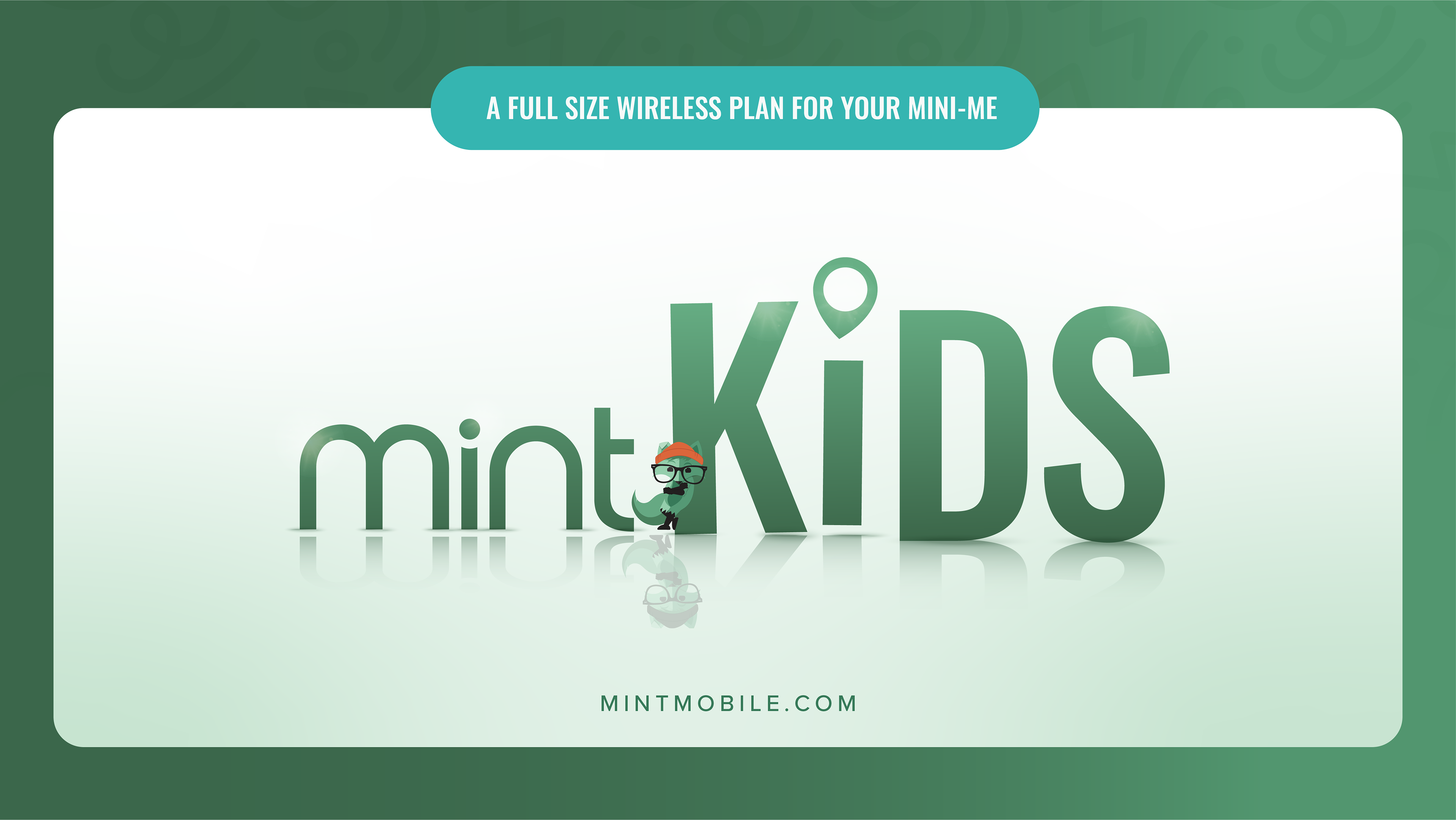
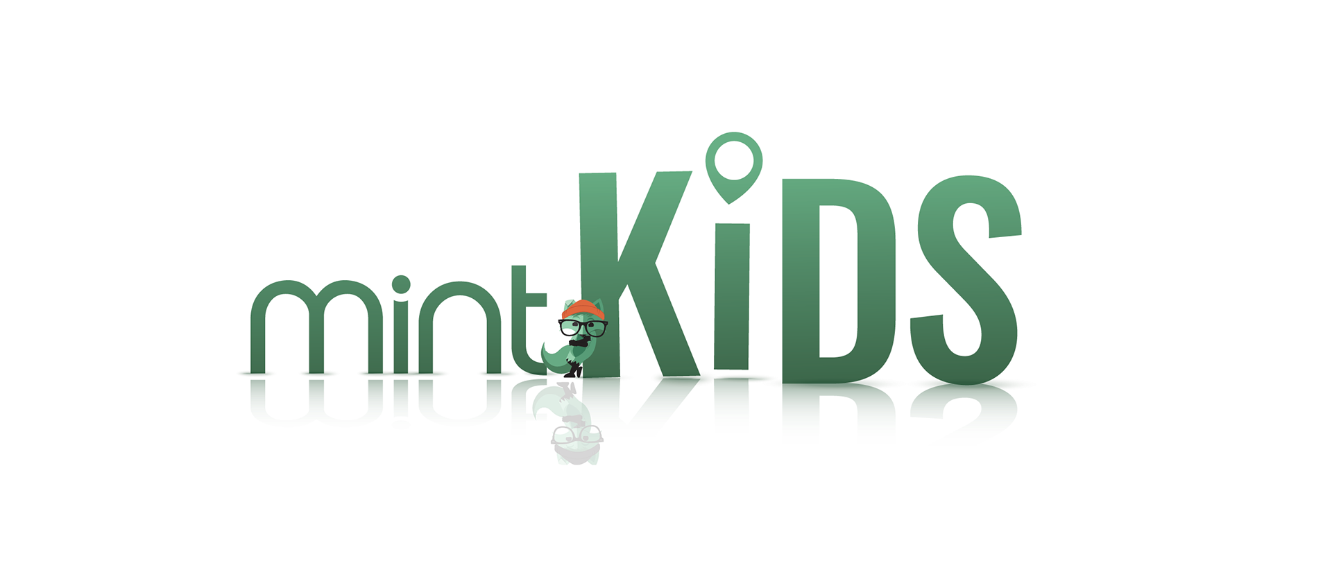
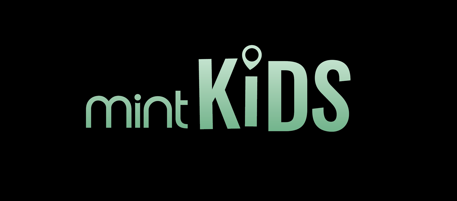
Logo Design
Bounce of the lowercase “i” – introduces personality and childlike motion
Subtle letter shifts to create warmth and imperfection
Organic shapes form a playful, Pixar-like visual world
Scales seamlessly across packaging, retail, and digital
Color + Typography
Mint core palette → expanded kid-friendly tones
Friendly, softened type system


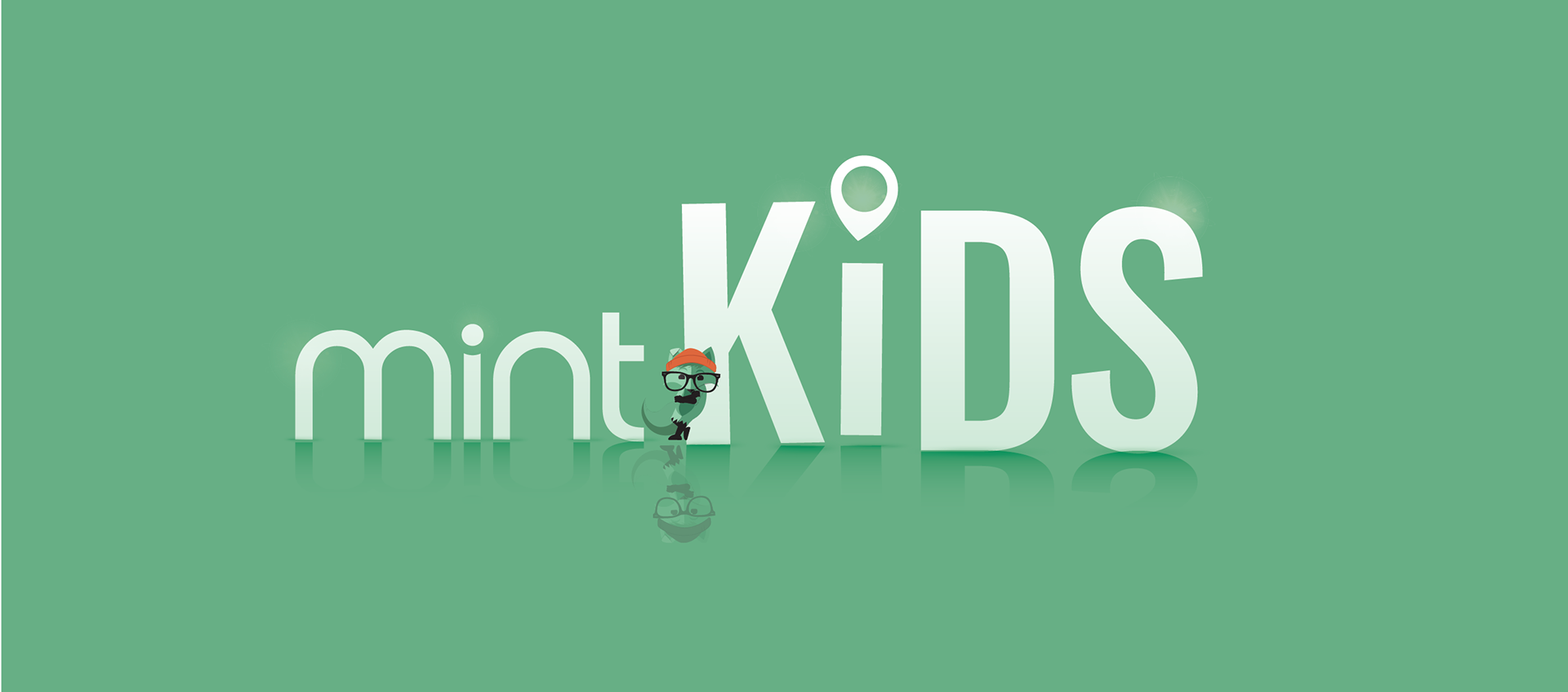
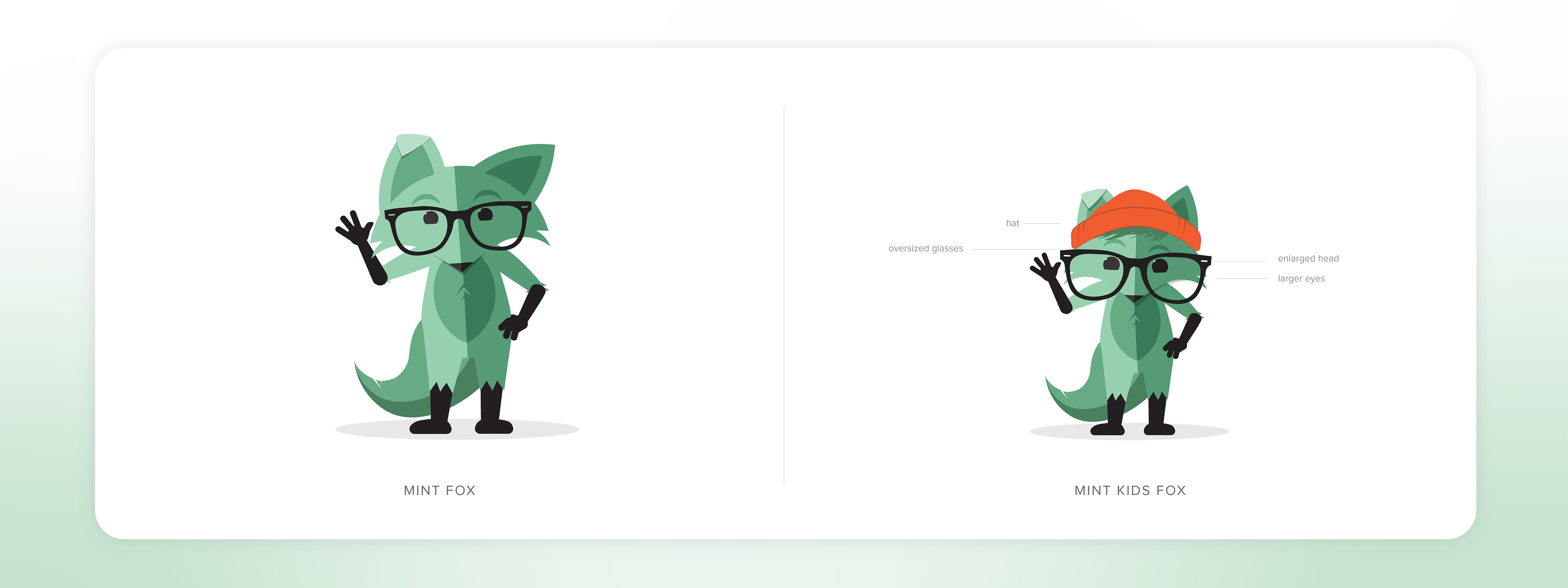
Character Evolution: Making the Fox More Youthful
Enlarged eyes for softer expression
Simplified shapes for a gentler, more trusted character
Adaptable posing to support storytelling and shelf presence
Visual Worldbuilding: A Safe, Imaginative Mint Universe
We created a design system that feels like stepping into a Pixar-inspired landscape—a safe, whimsical environment where parents can imagine their kids exploring independently:
Soft gradients and rolling horizon lines – Organic cloud-like forms – Layered, dimensional foliage reminiscent of kids storybook environments – A palette rooted in Mint green but expanded to brighter, friendlier tones

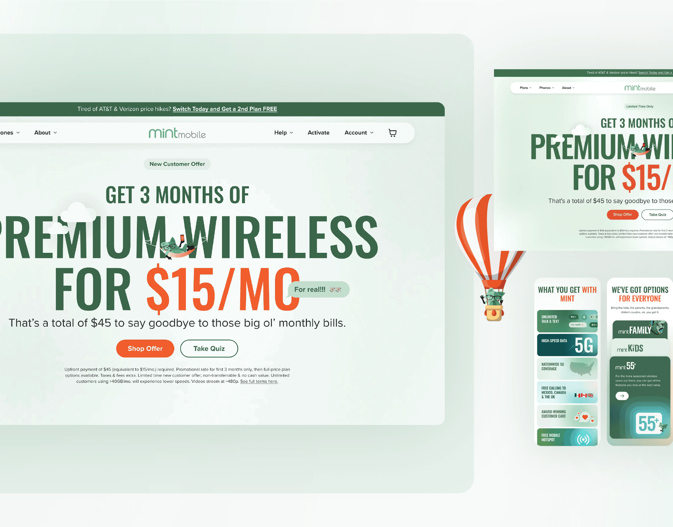
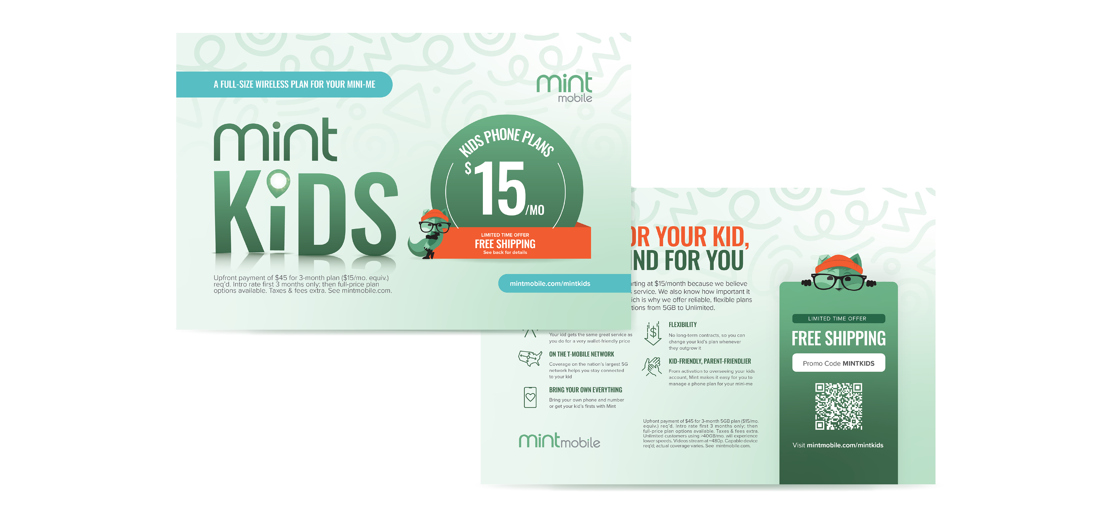
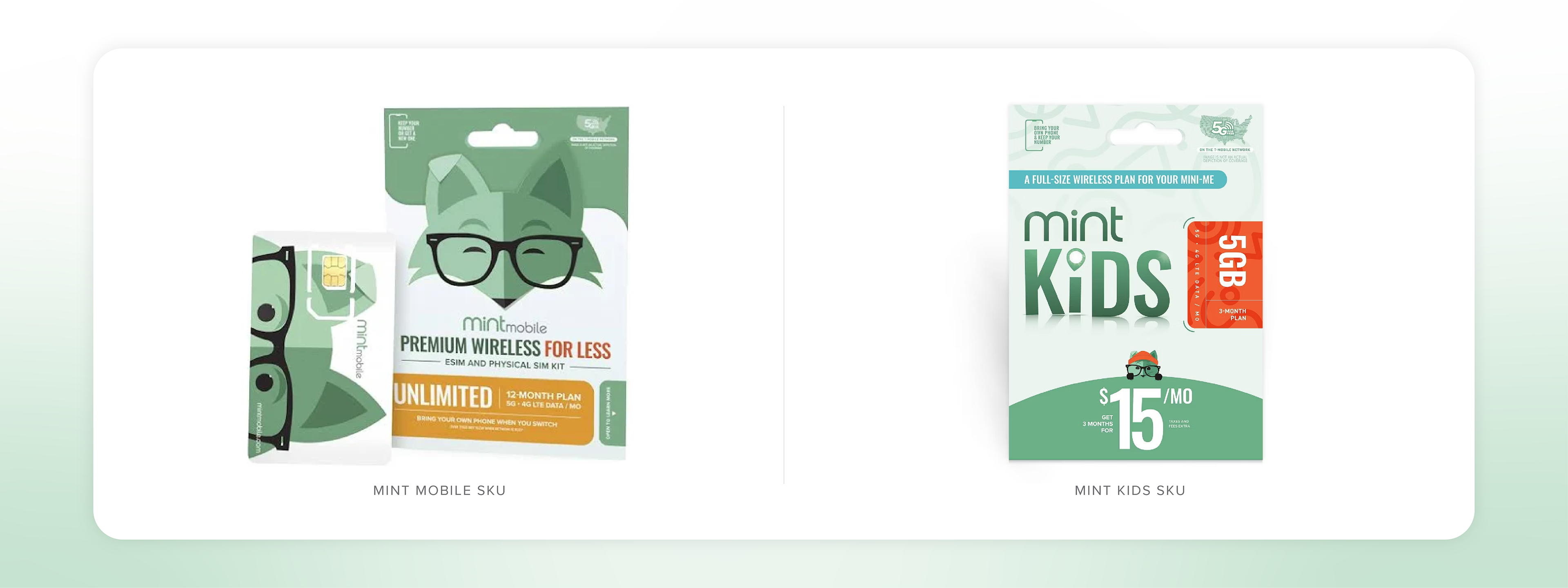
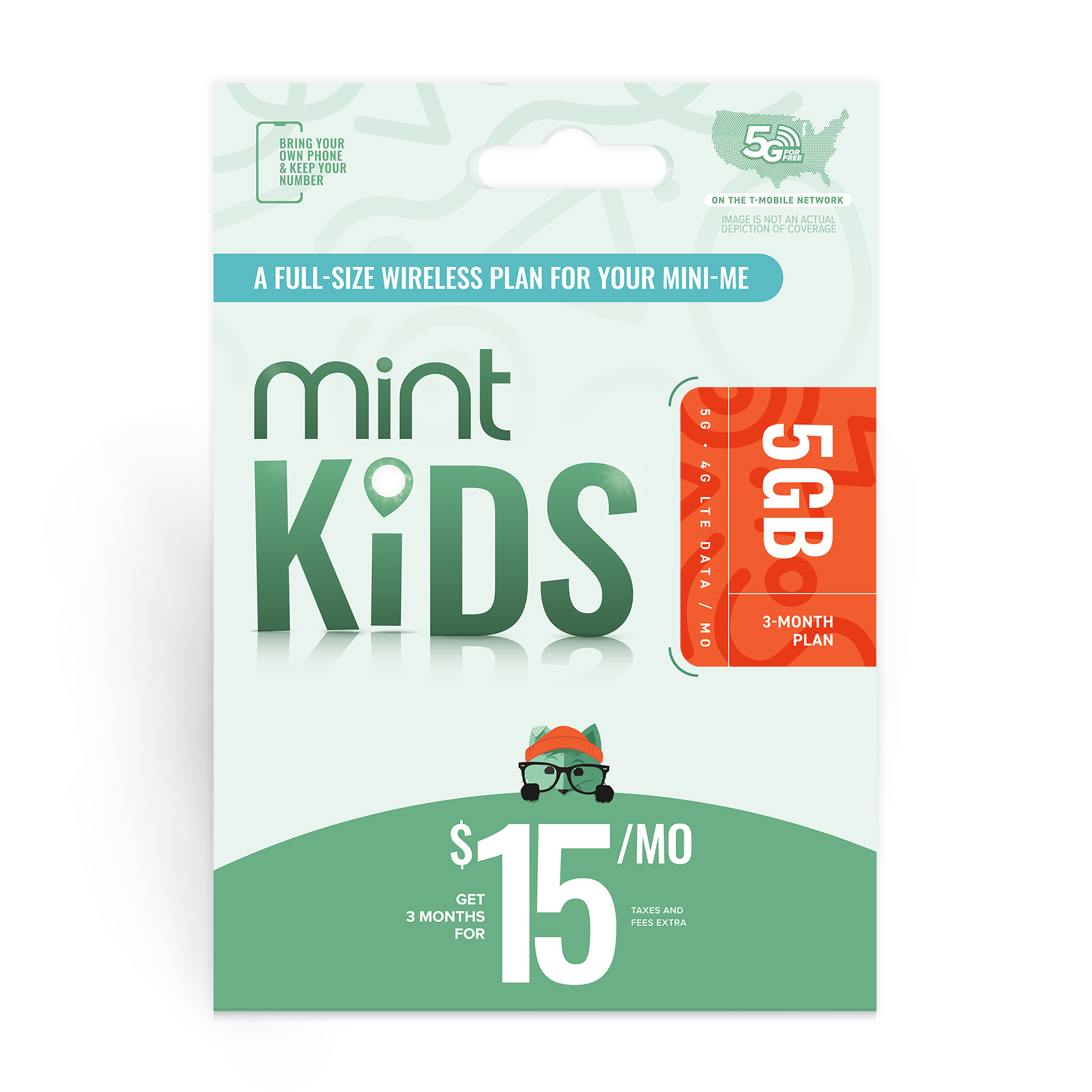
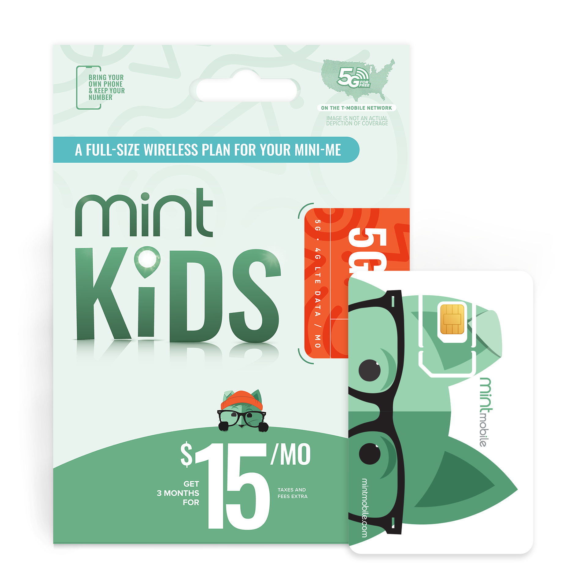
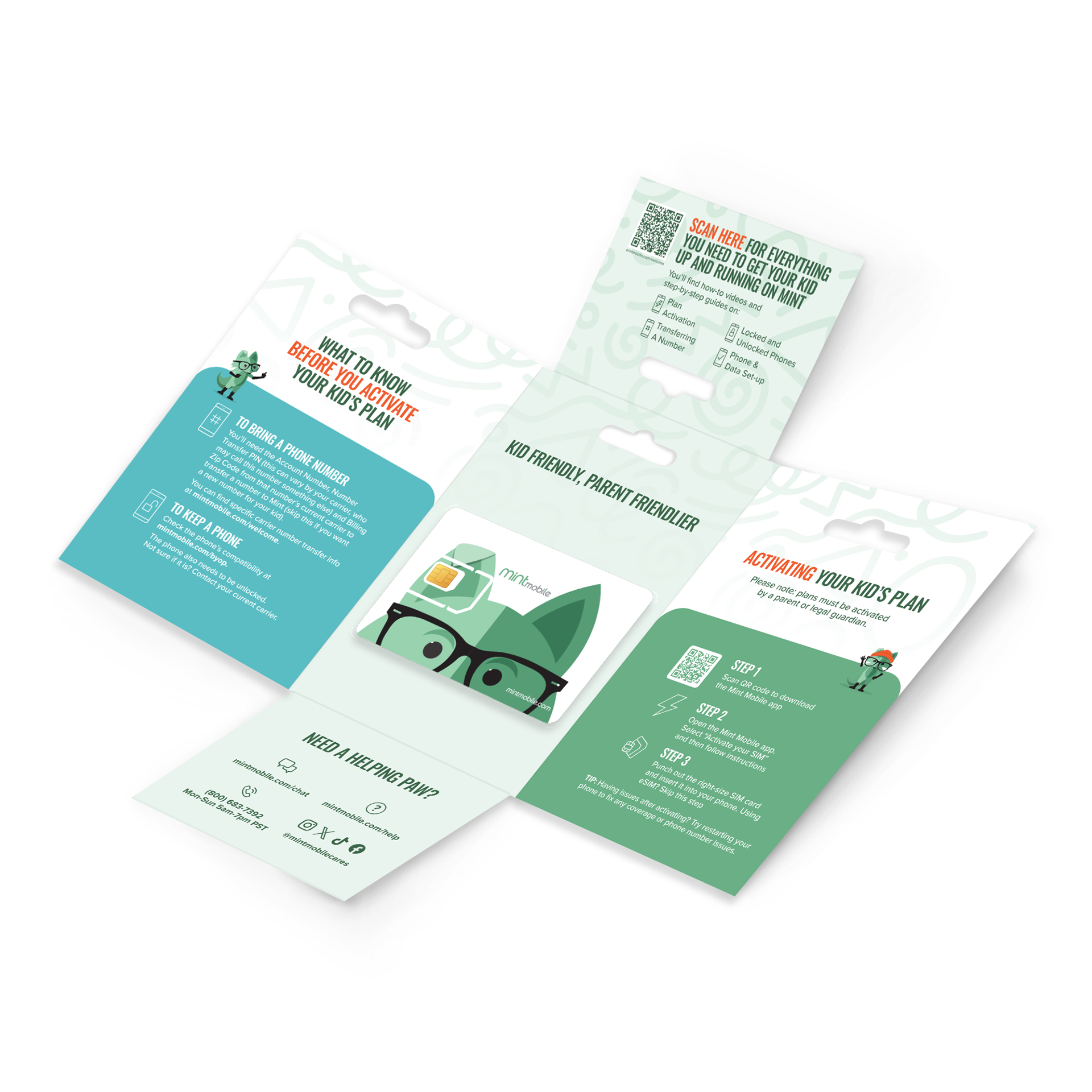
The First New Mint SKU in Years
Distinct shelf presence – Clear hierarchy for parents – Fox-led storytelling
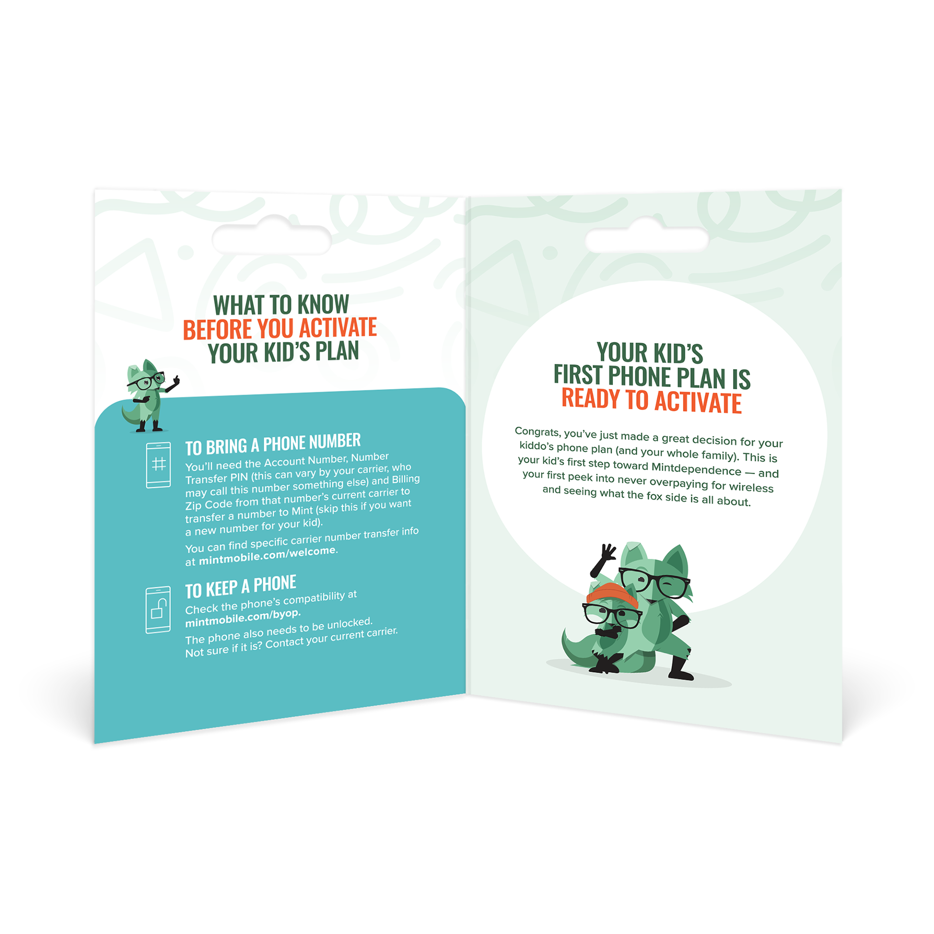
“We’re not here to tell you when your kid should get a phone — just to offer a safe solution when you decide the time is right.”
Value propositions: Safety – Peace of mind – Reliability – Connection – Flexibility
Positioning Mint for a New Growth Category
Mint Kids created:
Mint Kids created:
A fully realized subbrand with shelf, digital, and experiential range
A trustworthy design system grounded in imagination + safety
A strategic path into a previously untapped $400MM category
A parent-first story that respects differing family timelines