Challenges
First time launching paid OOH. Needed instant clarity in fast-moving urban environments. Had to maintain Mint’s irreverent tone without sounding like telecom advertising
Insight
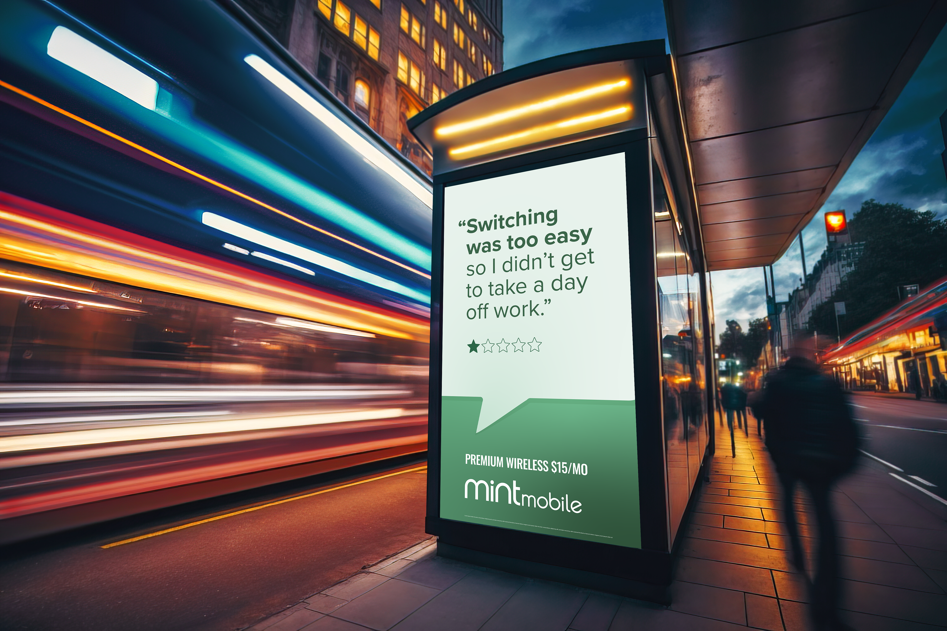
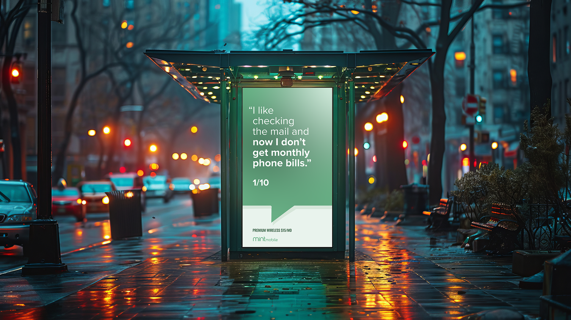
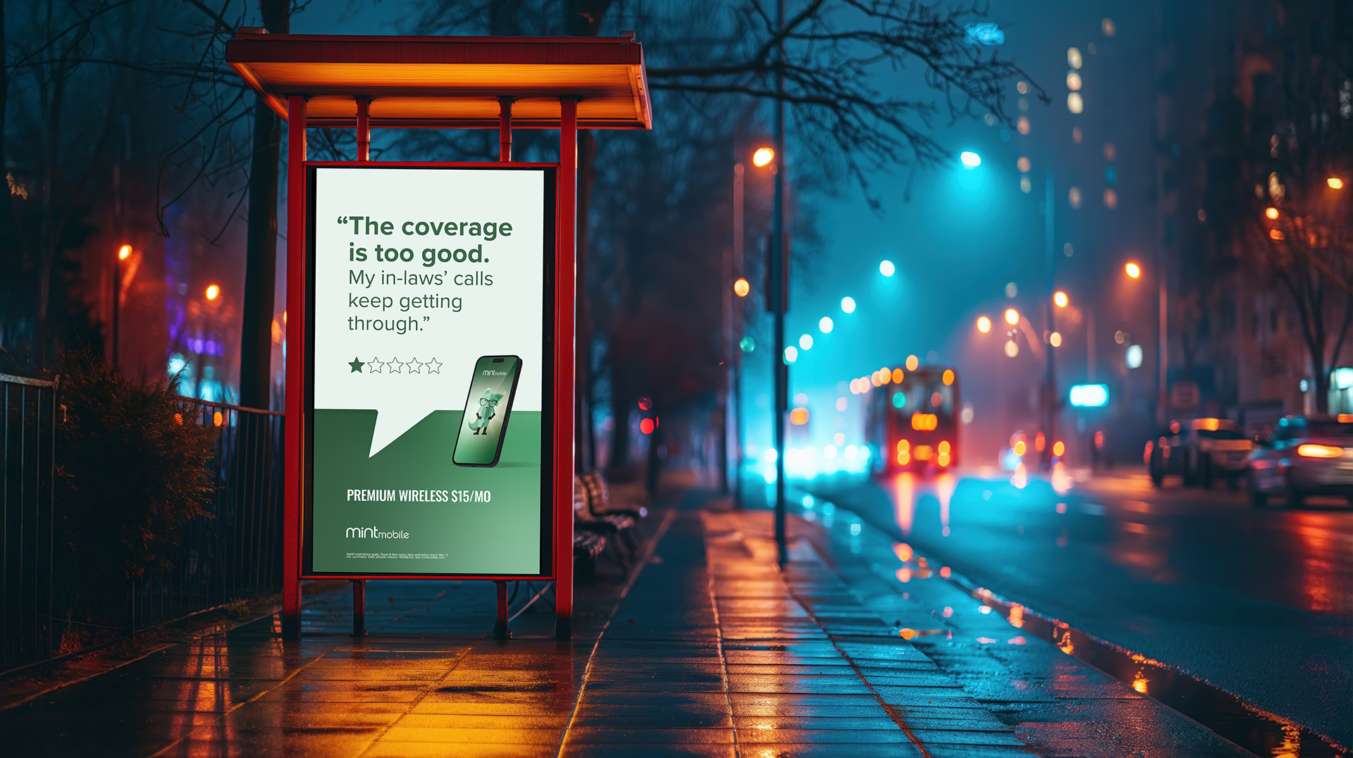
Some of Mint’s strongest benefits sound like drawbacks at first. Coverage, simplicity, and ease can feel like “problems” until you experience the upside.
Idea
Short, conversational headlines written to sound like complaints — then flip into benefits on a second read.
The visual system was built to support speed, clarity, and brand confidence:
High-contrast Mint green for strong visibility in day and night conditions
Minimal layouts that let the headline lead
Conversational typography optimized for distance and motion
Consistent hierarchy designed for instant comprehension
Urban photography grounded each execution in its environment, allowing the city to frame the message rather than compete with it.
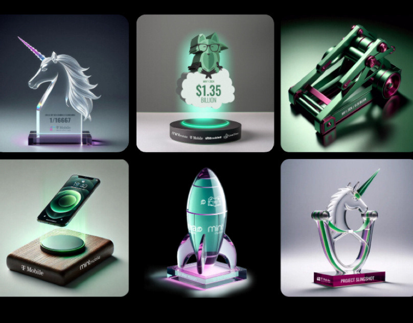
Impact
The campaign launched as digital OOH transit placements across New York, Los Angeles and Chicago. Each unit followed a consistent framework while allowing the copy to remain the primary storytelling device. Proved the brand voice could scale into paid media. Created a repeatable framework for future transit and paid work.
My Role: Concept, art direction, visual system design, and execution.
Copyrighting: Tim Heckman