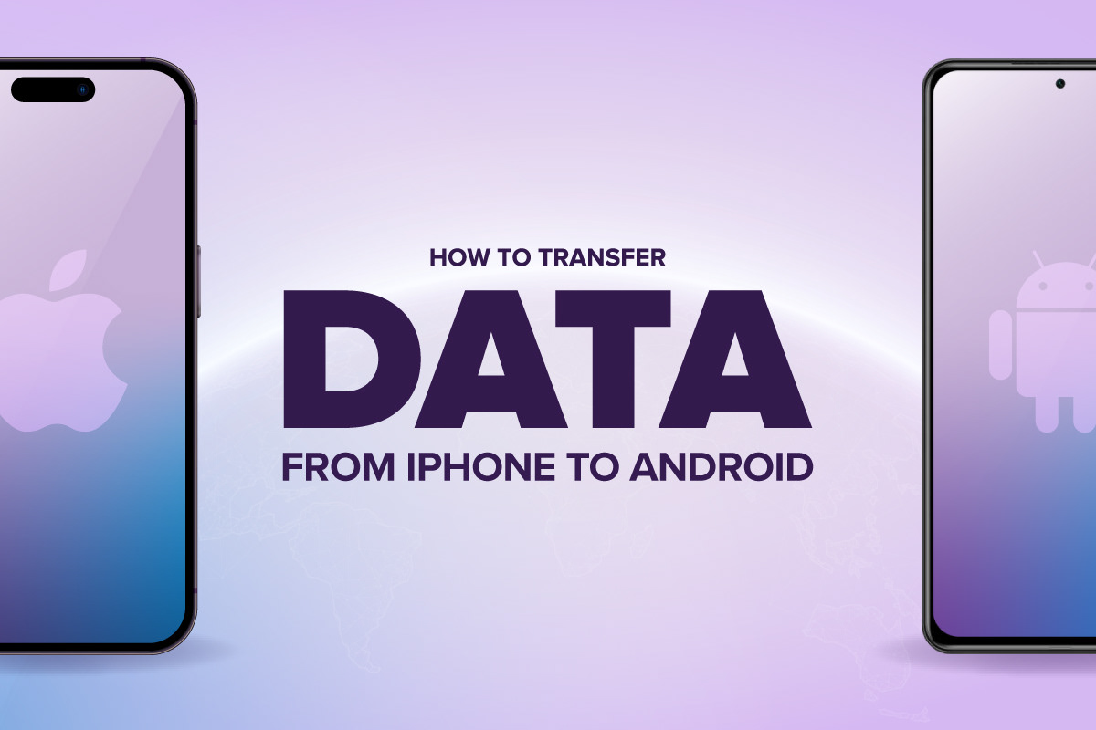
Blog Graphics — “How to transfer data from iPhone to Android” (Ultra Mobile)
Client / Platform: Ultra Mobile blog (consumer-telecom)
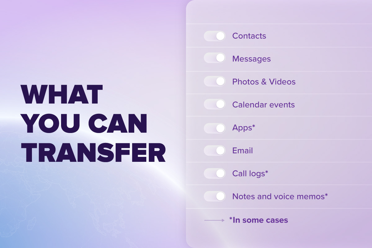
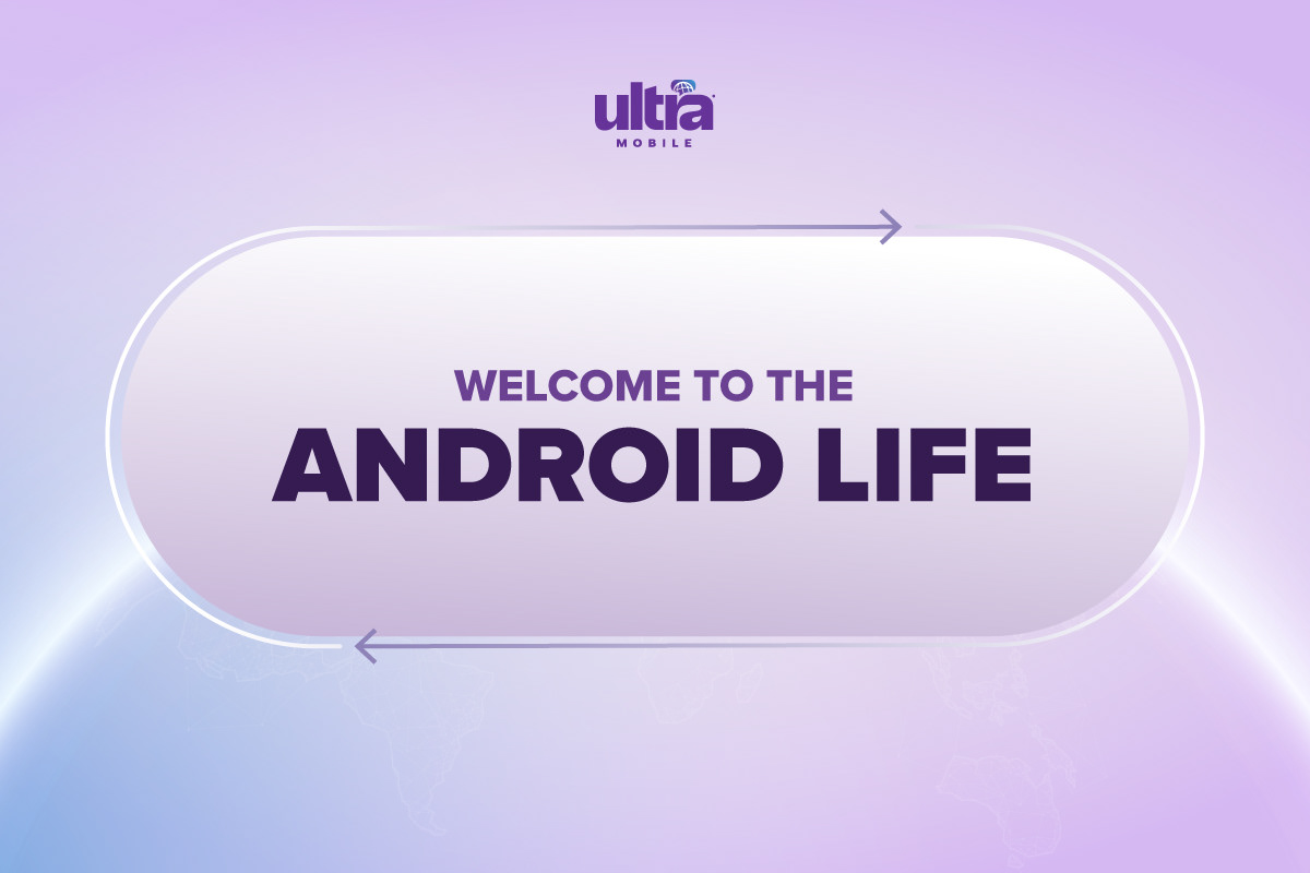
Project Scope: Created a suite of supporting visuals to reinforce the guide’s content and enhance readability, and brand alignment, developing visually appealing infographics for easier readability and understanding.
Impact: Enhanced the blog’s readability and made abstract instructions more concrete and approachable. Helped reinforce Ultra Mobile’s positioning as an easy-to-use switch, not just a telecom plan vendor (i.e., reducing anxiety around device switching). Created a cohesive visual toolkit that could be repurposed for social posts, email graphics, and future “switch”-related content.
Design Challenges & Solutions:
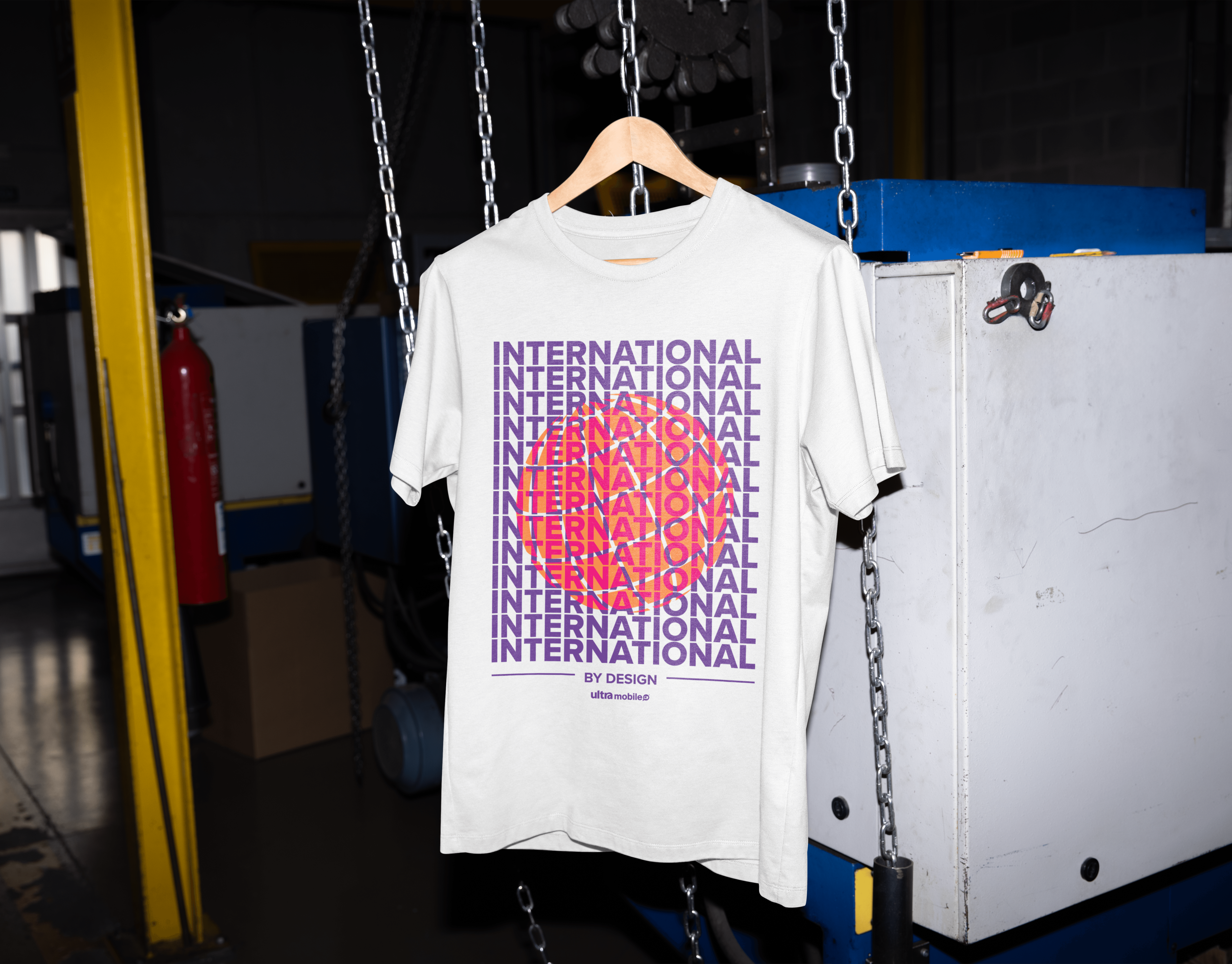
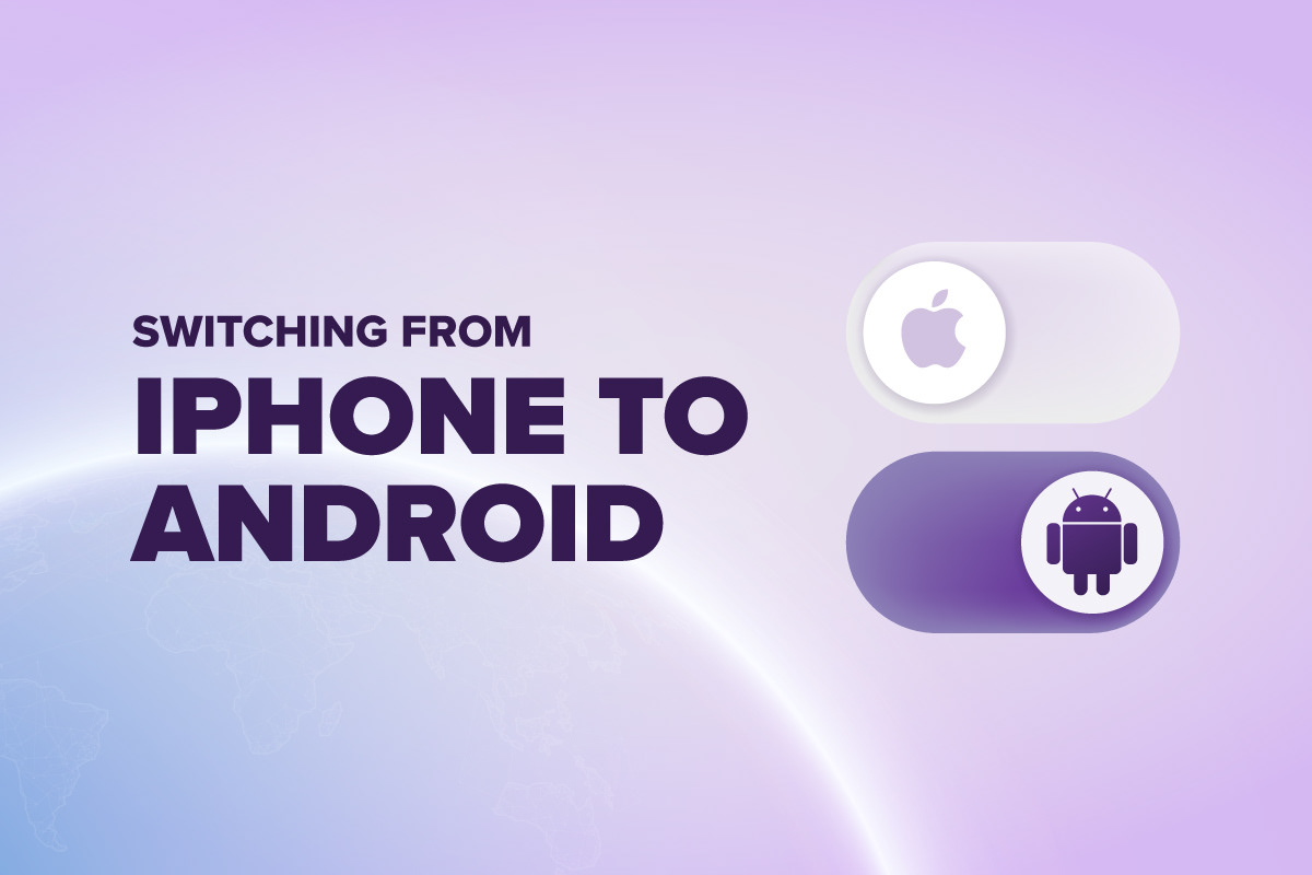
Challenge: Representing a seamless “switch” between two very different ecosystems (iOS → Android) in a way that feels friendly, not intimidating, while maintaining brand feel and ensuring clarity on icons/illustrations that might otherwise feel generic. Make the instructions visually appealing.
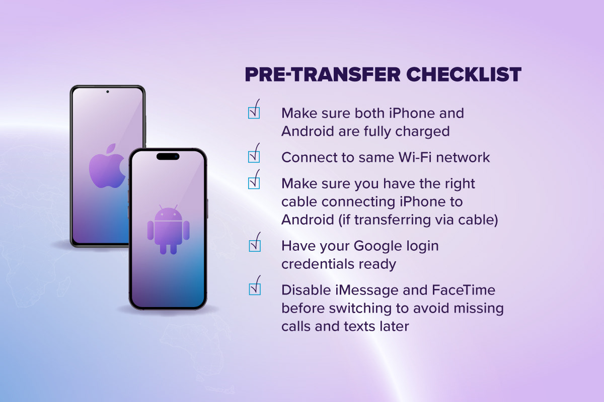
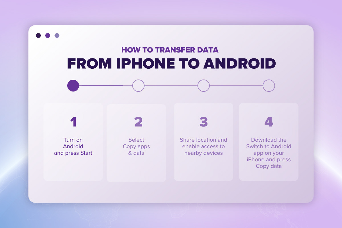
Solution: Used devices of equal size, connected via visual cues to show flow from one to the other; chose a palette that balances Ultra’s brand identity with neutral tech tones. Used modern UI tropes, toggles, and interfaces to break the content into visual information that is exciting and easy to read.
To connect back to the brand, I incorporated a dialed back radius of Ultra Mobile supporting globe graphic as a key visual, this time using it to emphasize the transition from one platform to another.