Overview
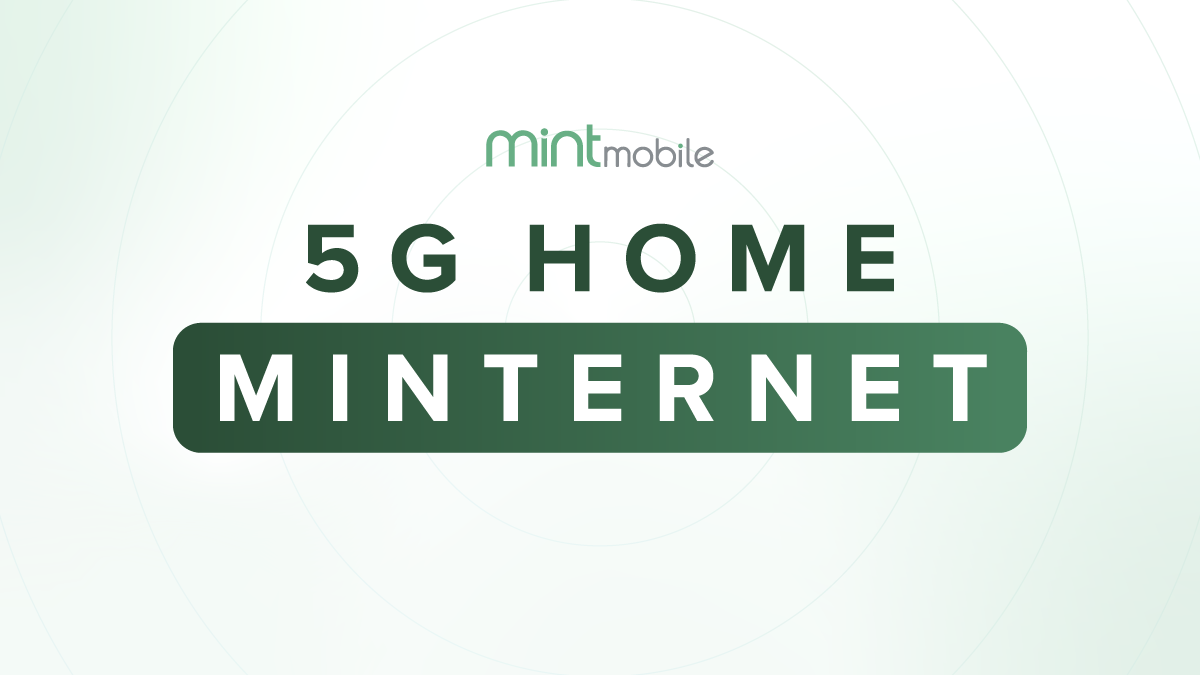
Mint Mobile launched 5G Home Minternet as a new product category for the brand. Unlike mobile plans, this offering had to live inside the home, interact with physical space, and clearly explain unfamiliar technology without feeling overly technical or “ISP corporate.”
The challenge wasn’t just creating marketing assets. It was designing a flexible, scalable visual system that could translate seamlessly across web, email, UI components, hardware illustration, packaging, and onboarding communications—while staying unmistakably Mint.
The Challenge
5G home internet is inherently complex. Coverage, setup, speeds, and compatibility are difficult concepts for customers to visualize, especially in a category dominated by confusing language and cluttered interfaces.
Key tensions:
Clarity vs. personality: Explaining technical value in a simple, friendly way
Consistency vs. flexibility: Maintaining a cohesive brand system across many formats
Scale vs. craft: Supporting rapid iteration without sacrificing design quality
The goal was to create a system that felt approachable, intuitive, and playful, while still communicating trust and reliability.
The Design Approach: we designed a rule-based visual system that could scale across mediums and contexts.
Core system elements
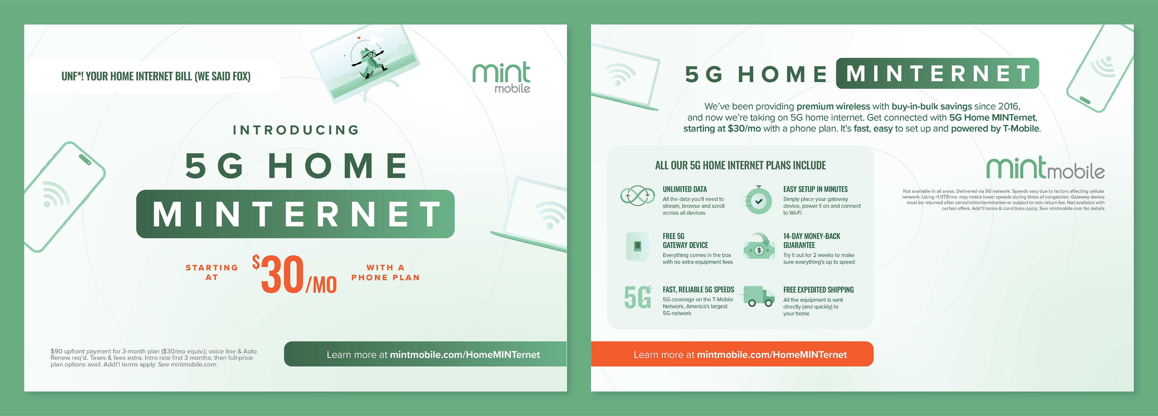
Radial signal motif
A flexible visual metaphor for connectivity, reach, and movement. The motif scales from subtle background texture to hero moments, adapting based on context without overpowering content.
A flexible visual metaphor for connectivity, reach, and movement. The motif scales from subtle background texture to hero moments, adapting based on context without overpowering content.
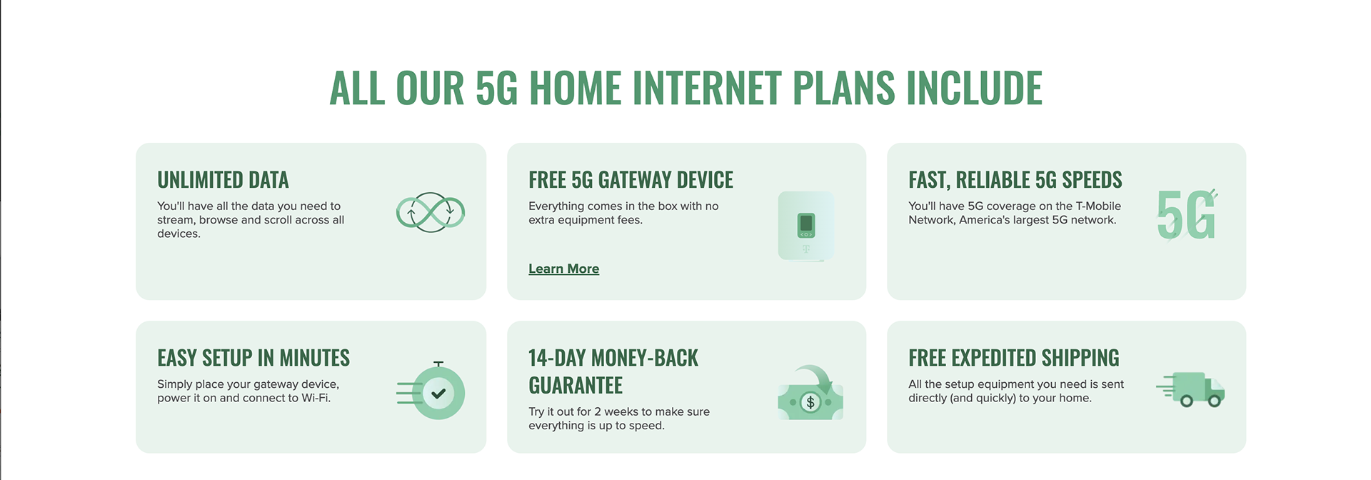
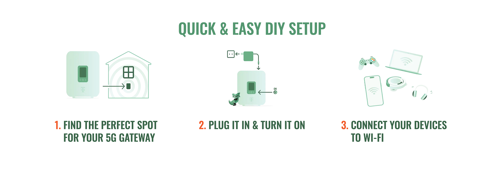
Iconography ecosystem
A cohesive set of abstract, friendly icons designed to explain concepts visually. Icons work across digital interfaces, emails, hardware diagrams, and physical inserts, reinforcing familiarity and reducing cognitive load.
A cohesive set of abstract, friendly icons designed to explain concepts visually. Icons work across digital interfaces, emails, hardware diagrams, and physical inserts, reinforcing familiarity and reducing cognitive load.
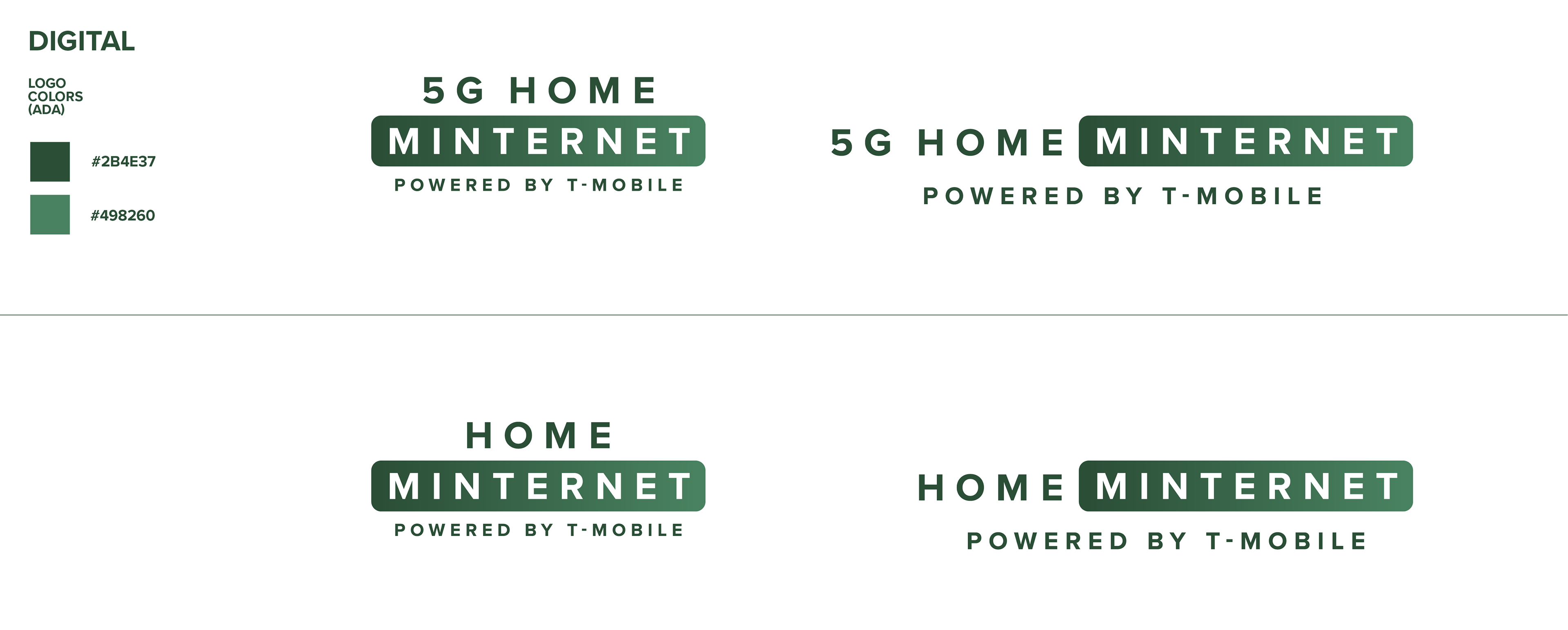
Color and hierarchy discipline
Mint green anchors the system, with white space used intentionally for clarity. Accent color is reserved for emphasis, especially pricing and calls to action, ensuring key information is always legible and prioritized.
Mint green anchors the system, with white space used intentionally for clarity. Accent color is reserved for emphasis, especially pricing and calls to action, ensuring key information is always legible and prioritized.
This system-first approach allowed the product to feel consistent even as layouts, formats, and surfaces changed.
Multi-Modal Execution
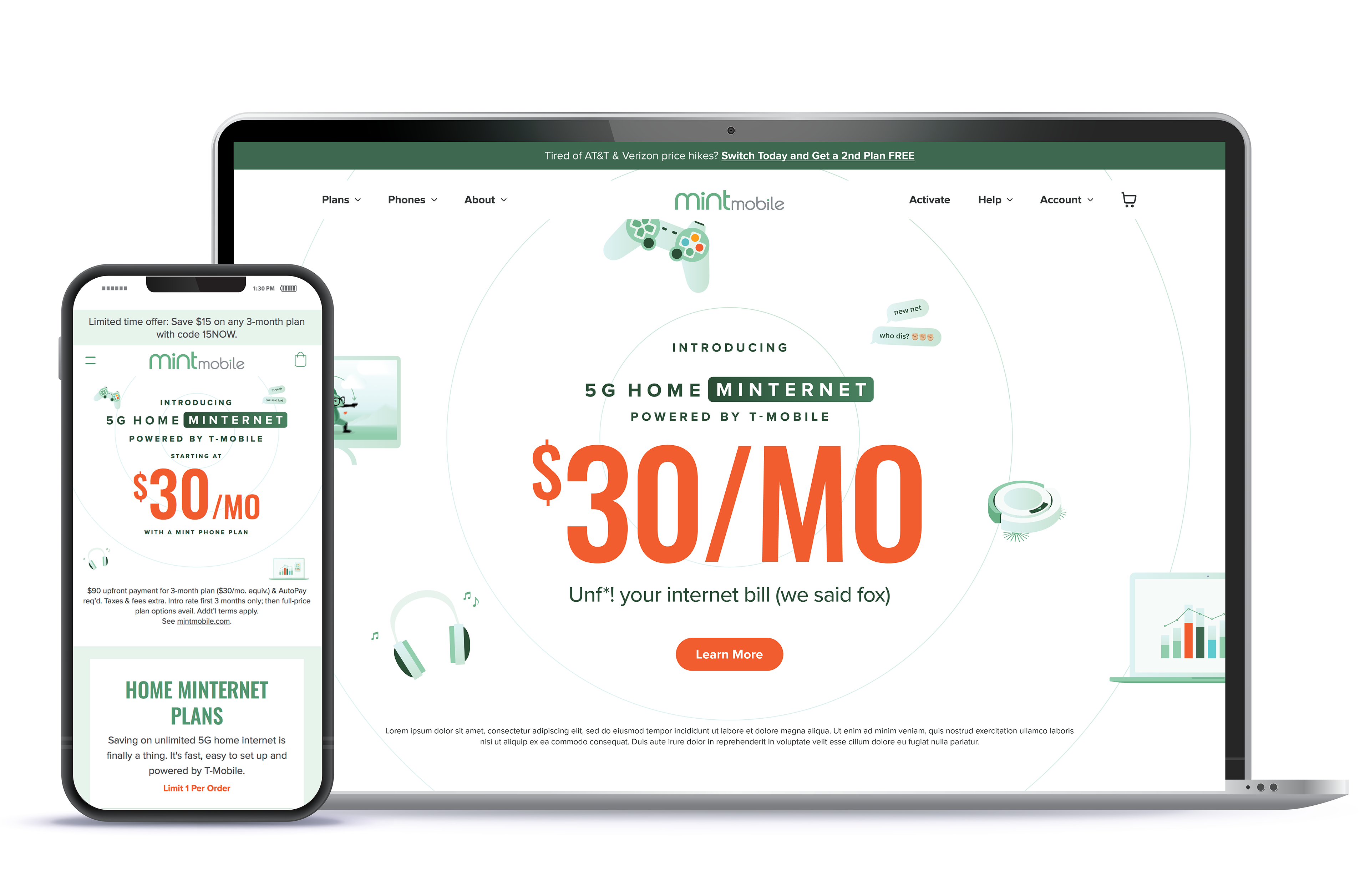
Web Experience (Desktop & Mobile)
The landing experience was designed around progressive disclosure:
High-level value and pricing up front
Deeper details layered in through plan comparisons, FAQs, and broadband facts
Responsive layouts that adapt hierarchy—not just size—based on screen and context
The result is an experience that feels clear and confident without overwhelming users.
Responsive Hierarchy:
The design transitions from a wide, multi-column layout on desktop to a stacked, vertical rhythm on mobile, ensuring the $30/mo value proposition remains the focal point on both devices.
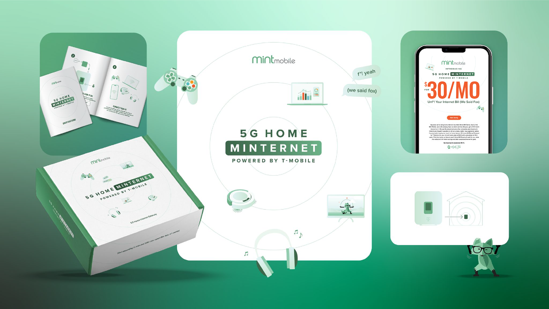
The final system supported a cohesive launch across:
Desktop and mobile web
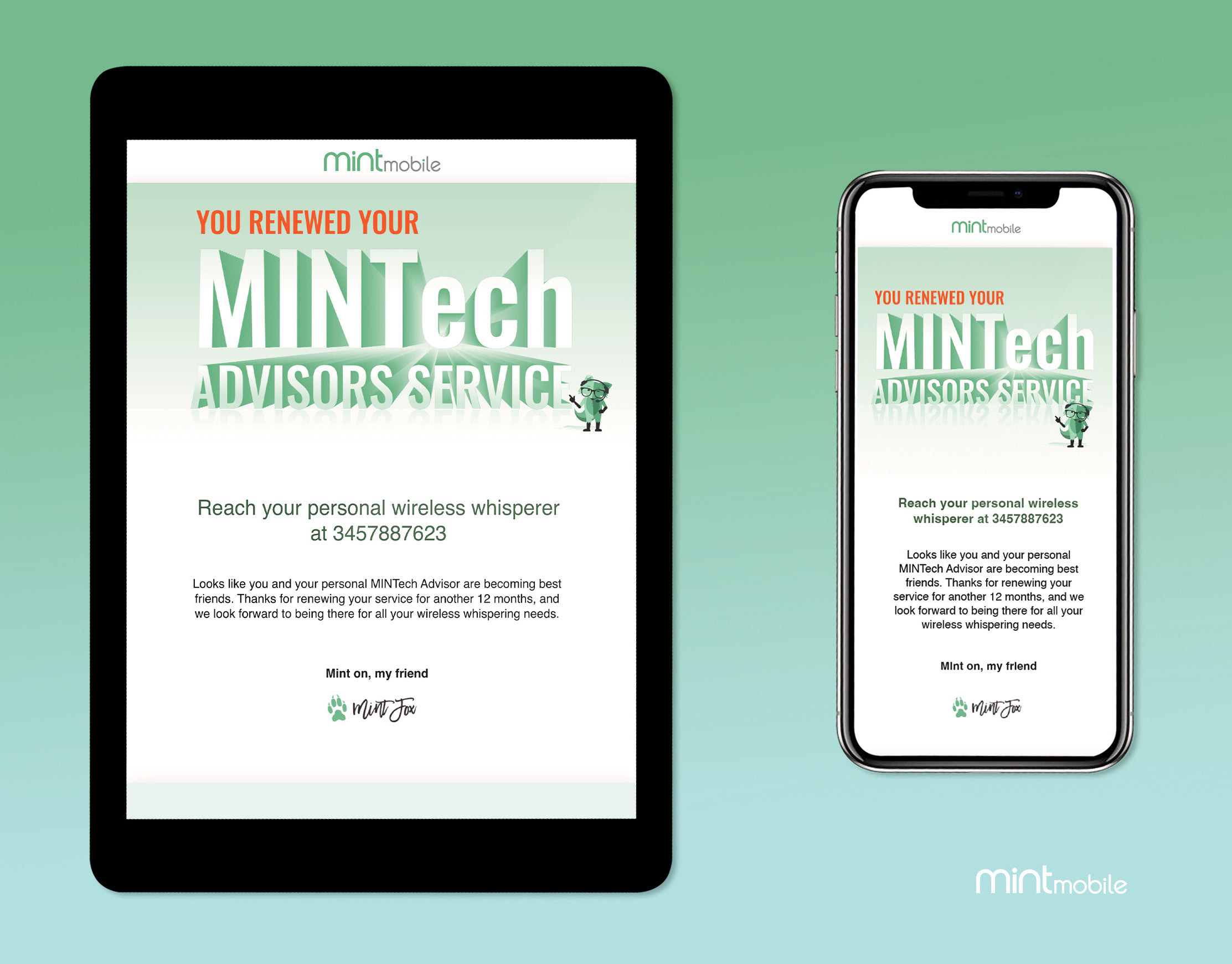
Email and modal communications
Iconography and UI components
Hardware illustration and setup guidance
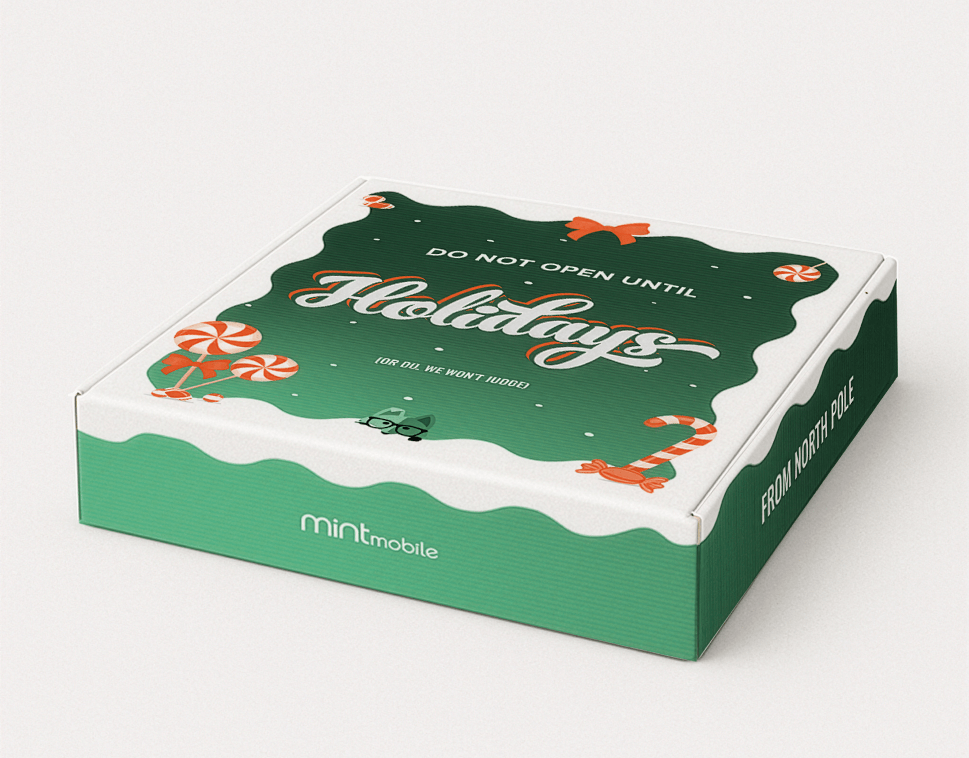
Physical packaging and inserts
Most importantly, it introduced a technically complex product in a way that felt simple, human, and unmistakably Mint.
This project reinforced the value of system-first design — defining clear rules, hierarchy, and intent so experiences can scale across mediums and evolve over time. That same thinking is what makes design systems adaptable to emerging, AI-assisted workflows.