Working closely with brand, marketing, and product partners, we refined core brand elements, typography, color usage, and layout systems to create a more flexible, scalable visual framework. The updated system was applied across digital, social, web, and campaign touchpoints—bringing greater consistency, clarity, and polish to how Ultra showed up in market. The result was a refreshed brand world that felt sharper and more contemporary, while remaining accessible and familiar to Ultra’s audience.
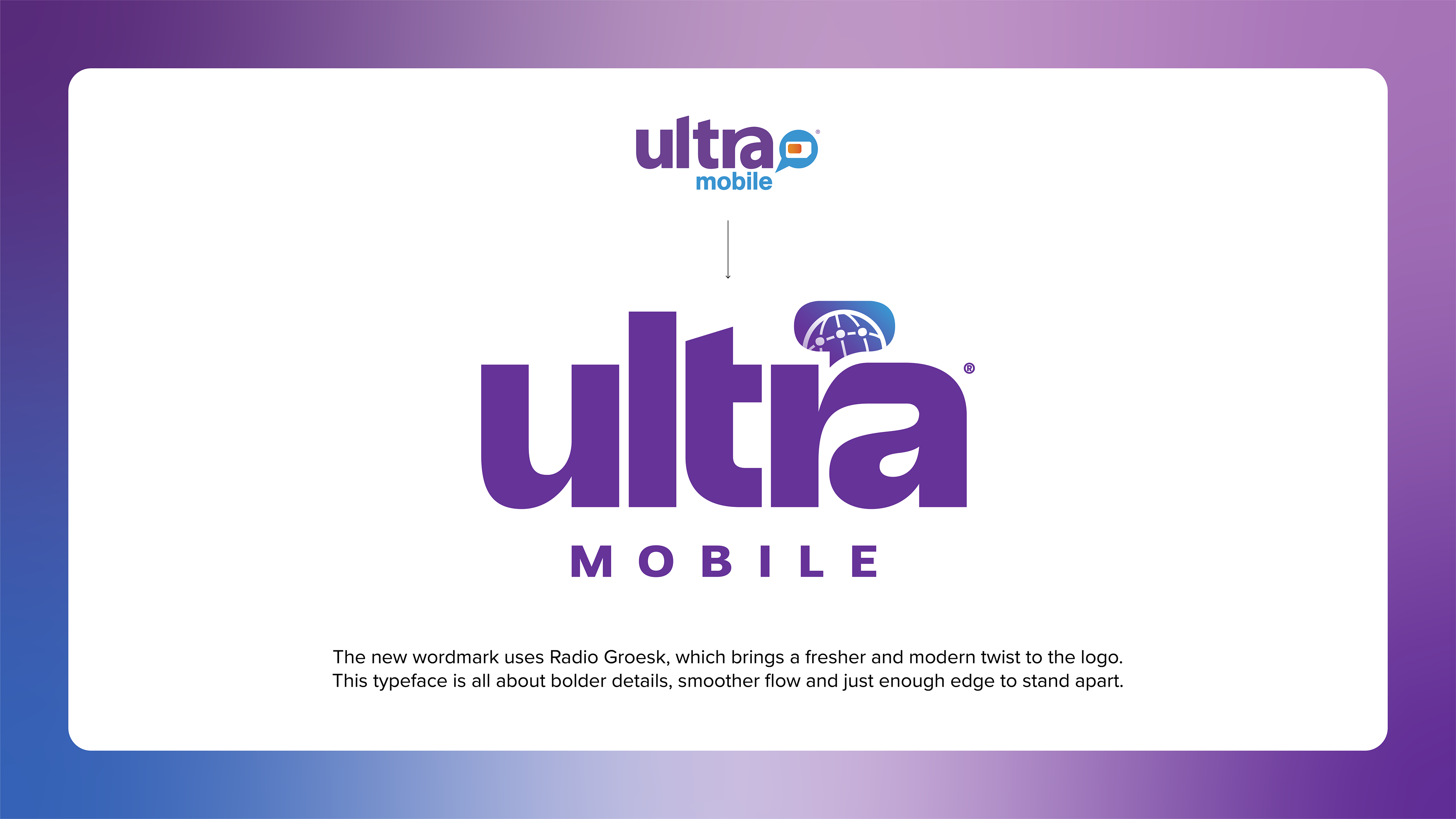
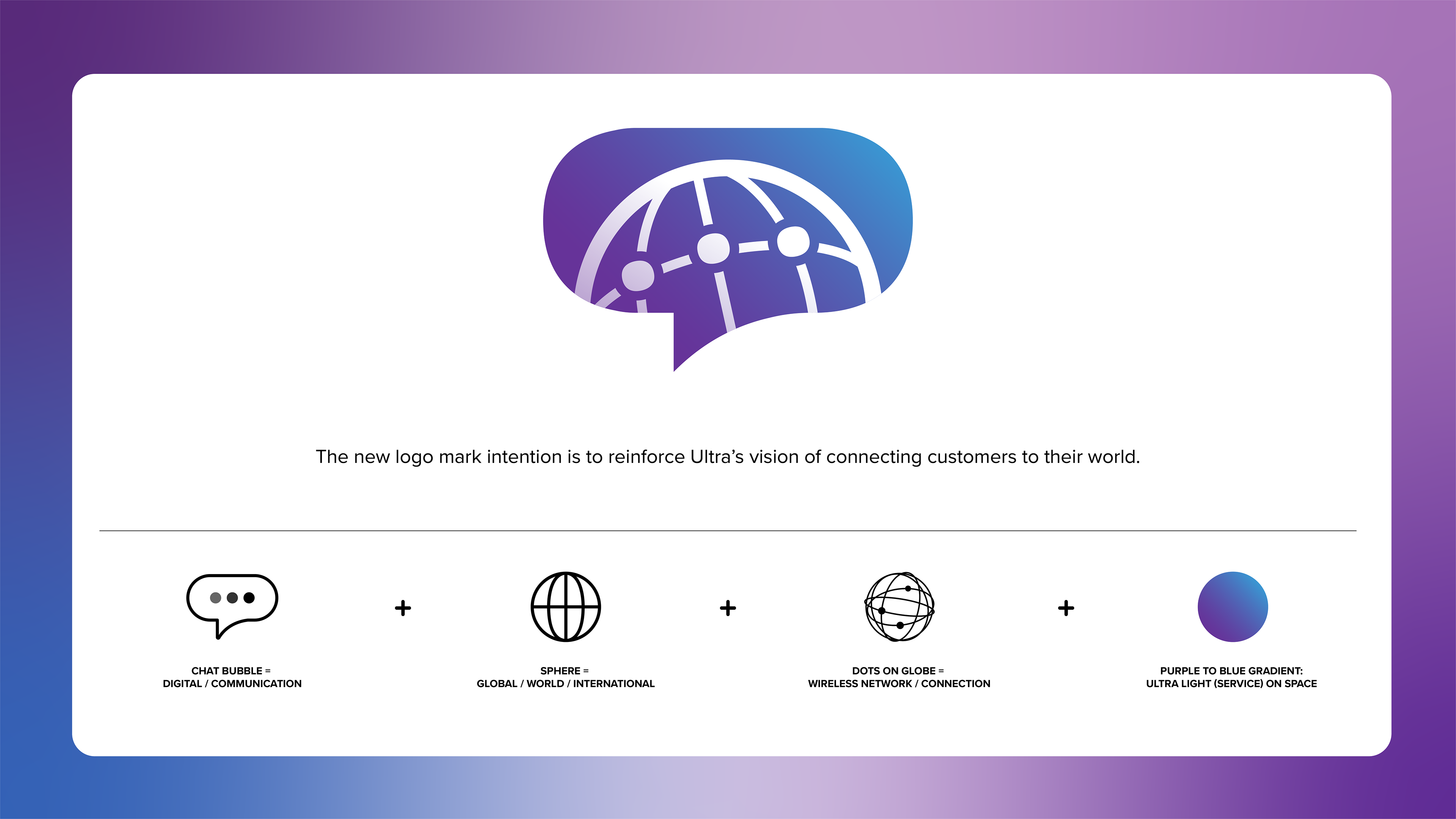
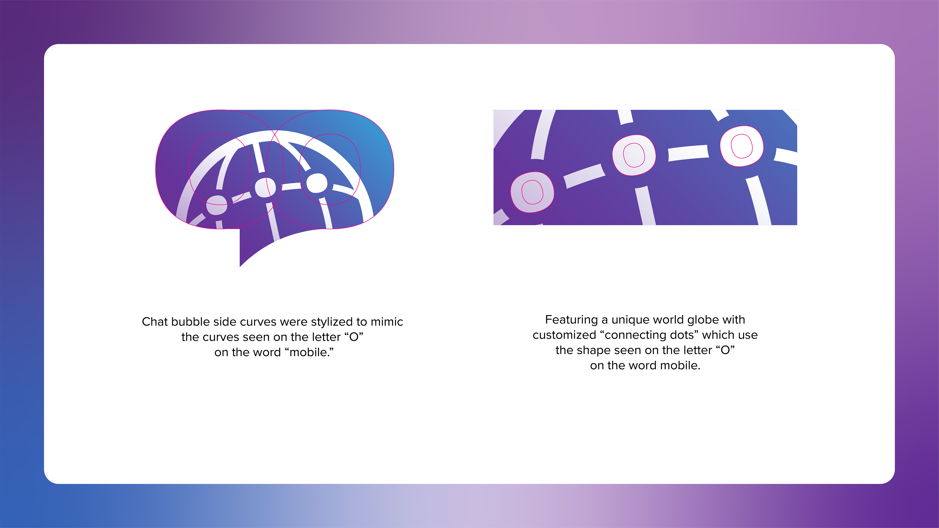
The new wordmark uses Radio Groesk, which brings a fresher and modern twist to the logo. This typeface is all about bolder details, smoother flow and just enough edge to stand apart. The new logo mark intention is to reinforce Ultra’s vision of connecting customers to their world.
You may also like

Create Your Path Campaign
Brand Strategy • Visual Identity • Style Guide • Print & Web • Campaign • Visual Identity • Style Guide • Print & Web
Additional Logo Design
el colacho baby devil, baby jumping festival, spain
Graphic Design
Logo Concept Archive - Letter T & letter C
Graphic Design, Lettering, Logo Design
Logo Designs - Peach Magnolia
Graphic Design, Illustration, Branding
Ultra Breaking the Grid
Break the Grid, Add visual interest. Take the visual ecosystem of Ultra Mobile, complete with bold type and curved graphic lines, and reinterpret it. reimagine it. More importantly, solve the problem that the monotony of day-to-day emails bring: customers become used to seeing one template, one design, and so the message doesn't come through. My objective was to break this monotany, but using the assets already existing within the visual lexicon of Ultra Mobile. i wanted to Break through the clutter. Using the curved lines prevalent throughout the graphic landscape of Ultra Mobile, my objective was to take a macro look at those curves, and zoom out, imagining them as part of a larger dimensional ribbon, assuming the whole was greater than the parts. In this case, the curvature was taken into the 3D world, where the curves start to fold and appear as a ribbon cascading down the email, increasing visual interest.
Graphic Design, Web Design, UI/UX
Mint Mobile X Google Pixel
Exclusive Mint Green Pixel 8 launch campaign and landing page for Mint Mobile, blending premium design with a high-value offer.
Graphic Design, Web Design, UI/UX
Mint Mobile – Fat Wallet Syndrome
To highlight Mint’s savings in a fresh way, we launched Fat Wallet Syndrome and introduced the Fat Wallet Saver, a real product that 500+ people purchased online. Supported by a chiropractor influencer and a vintage, prescription-style ad approach, the social campaign blended humor, insight, and brand storytelling to attack Big Wireless in a memorable way. Anchored by a chiropractor influencer and a retro, prescription-style ad aesthetic, the campaign blended humor, insight, and brand storytelling to attack Big Wireless while boosting brand awareness and reinforcing Mint’s value story.
Art Direction | Brand Moment | Product Design | Packaging
Website Initial Design
Art Direction, Web Design
WA Summer Camps
Brand & Website Design
Graphic Design, Illustration, Logo Design
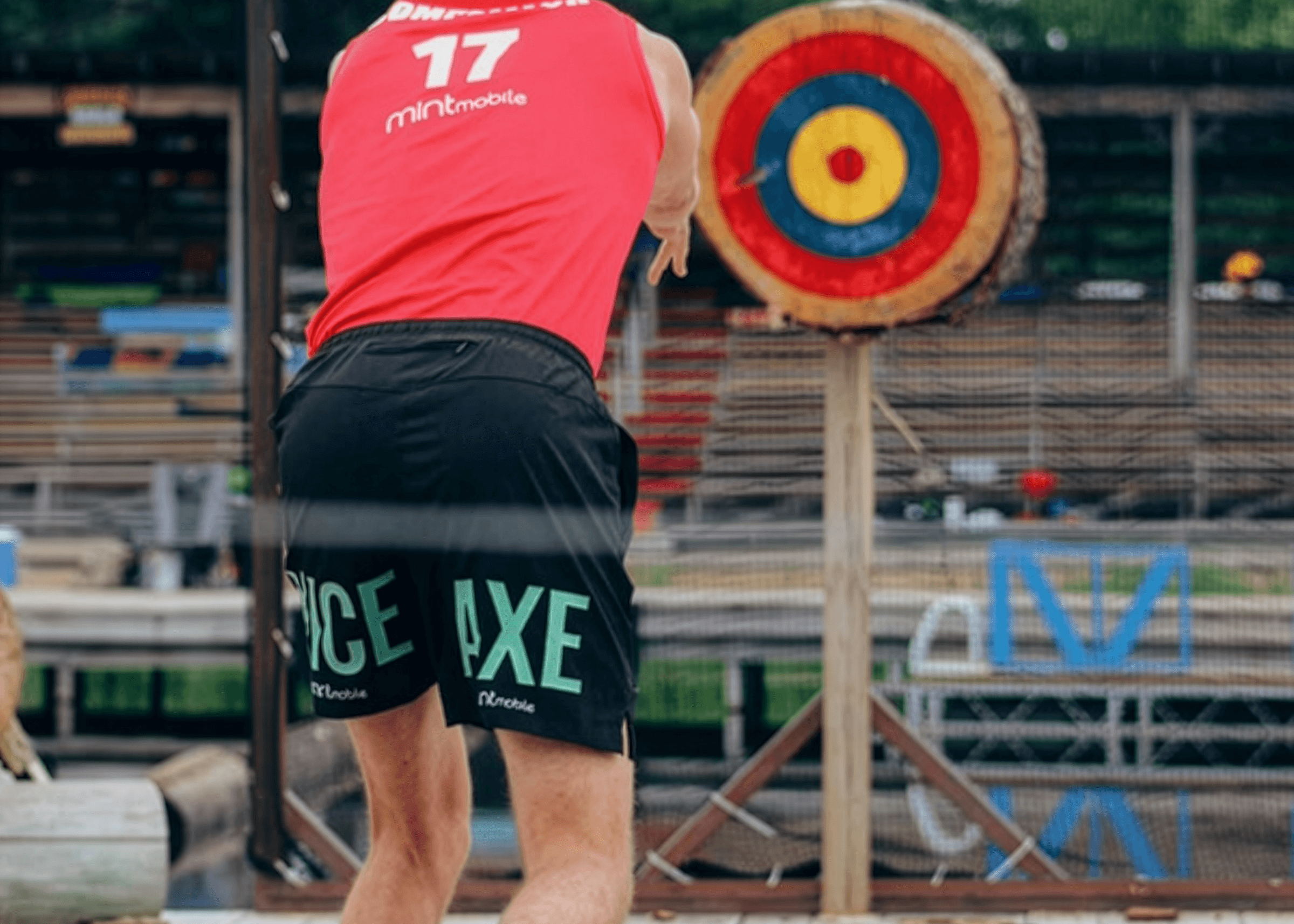
Mint Mobile × Lumberjack World Championships
Sponsorship Merch & Social-First Design
Apparel, Graphic Design, Advertising
Back to Top