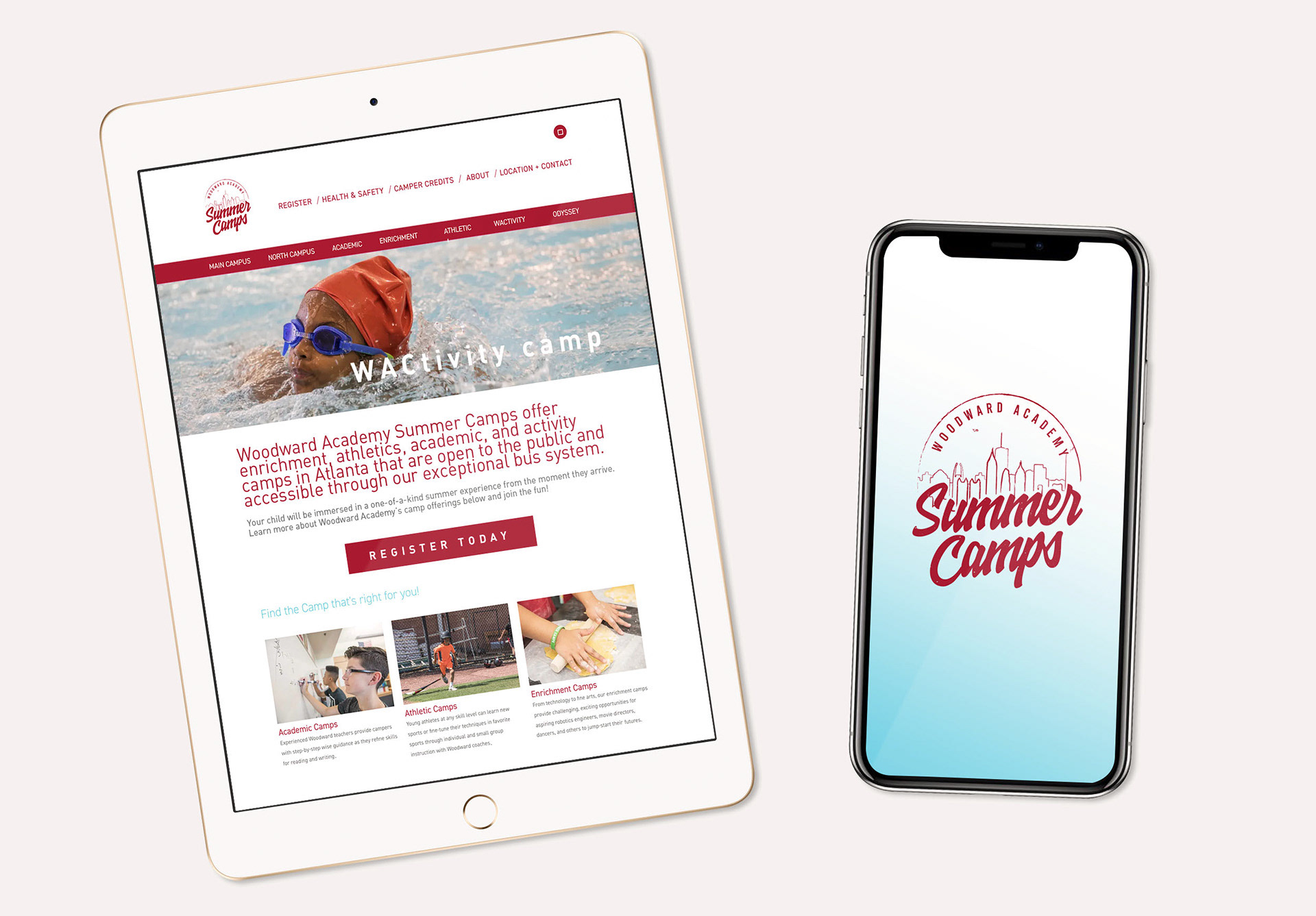
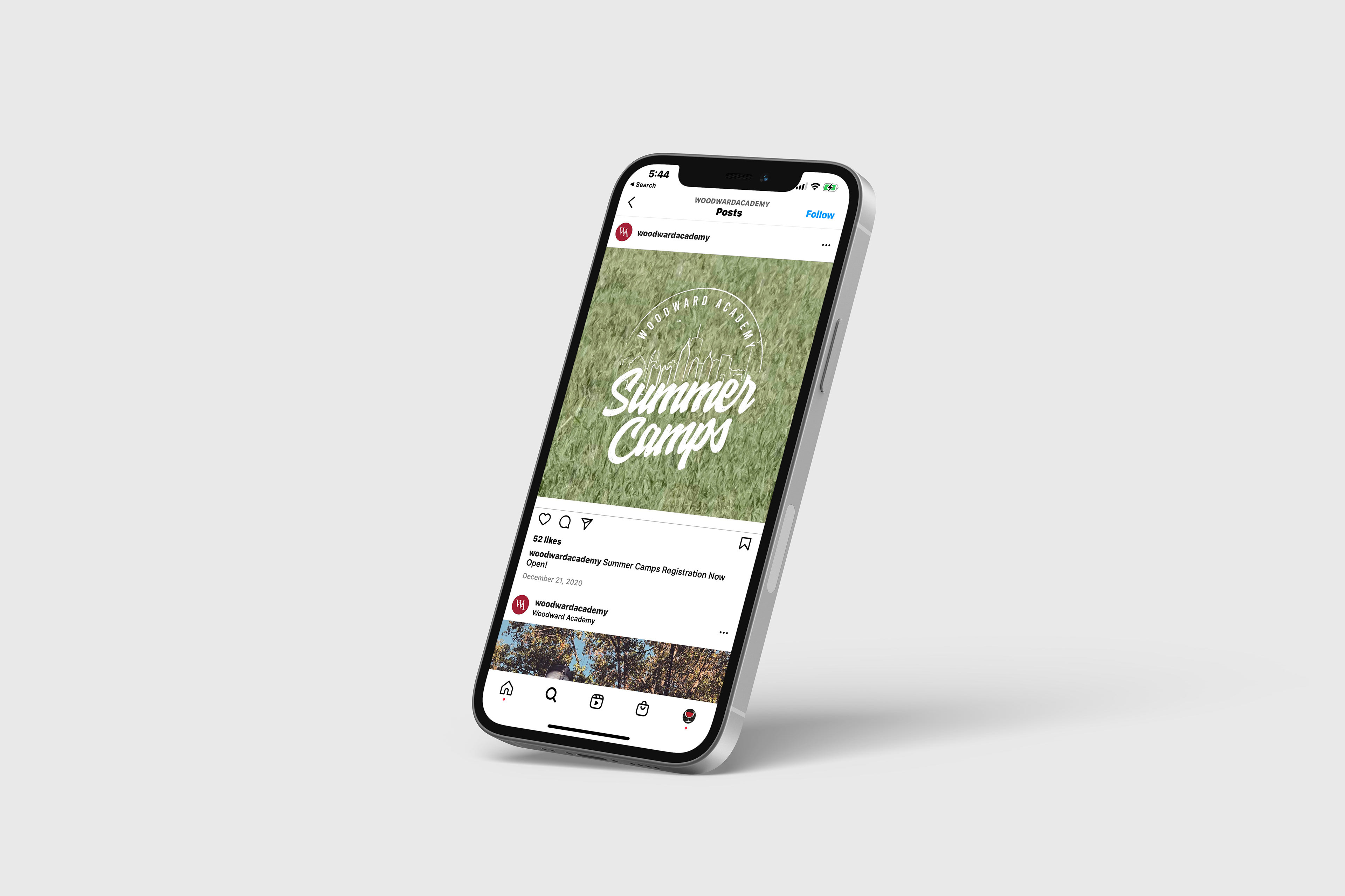
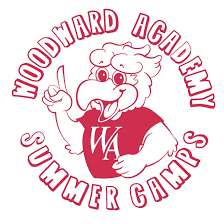
Woodward Academy’s Summer Camps needed a refreshed visual identity that felt energetic, modern, and connected to the master brand—while still standing on its own. The previous mark lacked dimension and didn’t clearly speak to place or experience. My goal was to develop a flexible logo system that honored Woodward’s established brand standards but introduced a youthful, seasonal, and adventure-focused tone.
Design Challenge
The updated identity had to:
Maintain recognizable Woodward brand colors, leveraging the academy’s existing red, black, and warm neutrals but with a fresher, summer-friendly palette extension.
Feel distinct from the main academic identity, signaling a sub-brand with its own personality.
Quietly allude to Atlanta, the campus sits within the city, yet the perception among families was that it felt “too far.” The logo needed to re-anchor the camps to their true ATL roots.


Solution
I explored iconography, type pairings, and color treatments that balanced structure with play. The final mark integrates subtle geographic cues—shapes inspired by Atlanta’s skyline angles and tree-lined landscapes—paired with typography that remains true to Woodward’s heritage. This gives the logo familiarity for current families and a refreshed energy for prospective ones.

Website Design